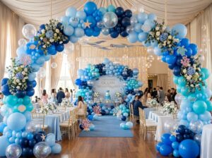
“Art washes away from the soul the dust of everyday life,” as Picasso once said, and honestly, in 2026, my living room soul was feeling pretty dusty! I used to think that 7 living room designs with artwork were only for people with massive budgets or fancy degrees in art history. Boy, was I wrong! Last year, I stared at my blank beige walls until I practically went blind, realizing that the right wall decor is the literal heartbeat of a home. Whether you are into contemporary art, abstract paintings, or just some cool framed prints you found at a thrift store, how you arrange them changes everything. Let’s dive into some real-talk designs that will make your interior design pop without making your wallet cry.

1. The Floor-to-Ceiling Maximalist Gallery Wall

I remember the first time I tried to put together a gallery wall in my own house. I was so scared of making a mistake that I only hung two small pictures and left the rest of the wall totally empty for months. Talk about boring! Eventually, I realized that if you want a room to feel alive, you have to go big. A floor-to-ceiling look is great because it makes your ceilings feel taller and shows off your personality.
In 2026, the “museum look” is out and the “lived-in look” is definitely in. You don’t need a professional designer to do this, you just need a bit of patience and a lot of nails.
- Mix Your Styles: Don’t feel like you have to stick to just one thing. I love putting a heavy oil painting right next to a modern photography print. It makes the wall look like you collected things over many years instead of buying a “set” from a big box store.
- Frame Games: You can find great picture frames at yard sales or thrift shops. They don’t have to match! I actually think it looks better when you mix wood, gold, and black frames. It adds a layer of texture that keeps your eyes moving.
- Pick an Anchor Color: To keep things from looking like a total mess, try to have one or two colors that show up in most of the pieces. If you have a blue color palette, maybe most of your art has a little splash of navy or sky blue in it.
2. The Minimalist Oversized Statement Piece

I spent way too much time picking out tiny frames before I realized that one big piece of canvas art does the job better. It is one of those living room designs with artwork moves that just works every time. I used to think I needed a whole collection, but my living room ended up looking like a messy fridge door. That is when I switched to one giant painting. It acts as a perfect focal point and makes the room feel much more put together.
In modern living rooms, people are often scared to go big. But a huge painting makes the space look more expensive. It simplifies your interior design and gives your eyes a nice place to land. I tell my friends all the time that bigger is better when you want to make a point, and the same goes for your walls!
- Scale Matters: Try to pick a piece that is about two-thirds the width of your furniture. If the art is too small, it looks like it is just floating on the wall by itself.
- Abstract Choices: Choosing abstract art with a simple color scheme helps the room feel calm. You want the art to be part of the room, not a distraction.
- Neutral Colors: If your walls are a neutral color, a large piece with soft tones can tie the whole look together without much effort.
3. Symmetrical Sophistication with Triptychs

Sometimes you just want your home to look like those magazine pictures where every single thing is in the right spot. That is where a triptych—which is just a fancy word for a set of three frames—works like magic. In my own house, I used this idea to calm things down in a room that felt a bit too busy. It creates a natural balance that makes your mind feel at ease.
For this to work well, you need all three pieces to be the same size and hung at the exact same height. It is a great choice for a formal living room where you might have guests over for coffee. Just don’t leave too much space between the frames, or the look gets lost. A small gap of about two to four inches is usually plenty to keep the picture feeling like one big, connected story.
4. The Layered Lean: Art on Shelves and Ledges

I got so tired of making holes in my walls every time I found a new picture I liked. That is when I found out about picture ledges. It is a great trick for people who change their minds all the time or just don’t want to commit to a permanent spot. You just lean your framed prints on the shelf instead of nailing them down.
The secret to making it look good is to layer the frames. Put a big frame slightly to the side, then put a smaller one right in front of it. This gives the wall some depth and makes it look like you put a lot of thought into it. You can also add things like a small statue or a leafy plant so the whole thing looks natural and not too stiff. It is a very easy way to decorate because it is so easy to fix if you don’t like it the first time.
5. Integrating Art with Built-in Bookshelves

People usually think shelves are just for dusty old books, but they are a fantastic spot to show off your art collection. I love hiding little paintings between stacks of my favorite novels. It catches people by surprise and makes the bookshelf look way more interesting than just a wall of paper.
You can even use small easels to keep the art standing up straight inside the cubbies. If your shelves have lights in them, it is even better! The light makes the colors in your favorite pictures look great when the sun goes down. This is a smart way to use every inch of your wall space without needing a huge, empty wall to work with. It makes the room feel like a cozy, personal space where you can really relax.
6. The Bold Contrast: Dark Walls and Bright Art

I used to be really nervous about painting a wall a dark color. I thought it would make my living room feel small or like a dark cave. But honestly? It was the best thing I ever did for my art. When you put a bright painting on a dark blue or charcoal wall, the colors just jump out at you. It’s almost like the art has its own light.
I tell my friends that if they have a piece of art they really love, they should give it a moody background. I also added a little accent light above my favorite piece, and now it feels like a fancy museum in here. If you have some bright pop art or even some neon stuff, this is the way to go. It makes the whole room feel exciting and bold instead of just plain.
7. Mixed Media and Textile Art Installations

You don’t always need a frame and a piece of glass to call something art. Lately, I’ve been really into things like woven tapestries and macramé. These textile pieces are great because they make a room feel soft and cozy. Plus, they actually help stop that annoying echo if you have a lot of hard surfaces in your house. It’s like adding a blanket to your wall!
I like to hang a metal piece or a 3D sculpture right next to my regular paper prints. It adds a bit of texture that makes the wall look more interesting and not so flat. It’s a great way to show off your style without everything being a perfect square. Mixing different materials like wood, metal, and fabric makes your home feel like a collection of stories rather than just a store display.
Conclusion
Getting your living room art right takes some time and a few tries. I’ve moved my pictures around more times than I can count, and I still have a few extra holes in my walls to prove it! The most important thing is that you like what you see when you walk through the door. Whether you choose a huge canvas or a bunch of small frames on a shelf, just make sure it feels like you. Art is personal, so there isn’t really a “wrong” way to do it if it makes you happy. If these tips helped you get some ideas, go ahead and pin your favorite look on Pinterest to help others find some inspiration too!