I still remember the first time I painted my living room a deep, moody teal. My friends thought I’d lost my mind, but the second the sun hit those walls, the whole room just… woke up! It’s amazing how a little bit of pigment can totally shift your mood after a long day at the office. Whether you are looking for 7 colorful living room designs to overhaul your entire vibe or just want to sprinkle in some joy, you’ve come to the right place. Let’s be real, beige is fine for oatmeal, but your home deserves to be as loud and proud as you are. In 2026, we are ditching the “sad beige” trend and leaning into homes that feel alive and personal.

1. The Electric Jewel Tone Oasis

I’ve spent years teaching my students that art isn’t just about staying inside the lines, and I think your living room should be the same way. When I first started looking at 7 colorful living room designs, I was really drawn to those deep, moody colors like emerald green and sapphire blue. They call them jewel tones because they look like something you’d find in a treasure chest. I remember when I first brought home a deep emerald green sofa. My husband thought I was losing my mind! He said it would look like a giant moss ball. But once we put it in the room, everything changed. It felt rich and cozy all at once.
Start With a Statement Color
The first thing I tell anyone is to just pick one color and go big. Don’t be shy! I chose a deep sapphire blue for my main wall. It felt scary at first, like the room was going to feel small or cramped. But actually, it did the opposite. It gave the room a lot of depth. If you have a room with lots of natural light, these dark colors won’t feel like a cave. Instead, they feel like a warm hug. You can try a ruby red or a deep amethyst purple too. These colors are great because they don’t show every little piece of dust or every hair from the dog, which is a big win for me.
Why Velvet and Gold Work
Texture is really important when you use these big colors. Jewel tones look best on fabrics that catch the light. I bought an emerald green velvet chair, and it looks different every time the sun moves across the floor. Velvet makes the color look deeper and more “alive” than flat cotton does. To keep things from looking too heavy, I added some gold frames and a metallic coffee table. The gold acts like a mirror and it bounces light around the room. You don’t need a lot of it, just enough to make things sparkle a bit.
Balancing the Mood
One mistake I see people make is trying to make everything dark. You need some contrast or it gets boring. I used a light grey rug to break up the dark blue and green. This keeps the space from feeling too “heavy” on the eyes. Also, make sure you have lamps with warm bulbs. In the evening, the light hits those jewel tones and makes the whole room glow. It’s the perfect place to sit with a cup of tea after a long day at school. Jewel tones are definitely a bold choice, but they are so worth it if you want a space that feels special. And honestly, it’s much better than living in a white box!
2. Retro Sunset: Warm Oranges and Pinks

I’ve always thought that some of the best 7 colorful living room designs come from looking back at the past. My parents had this old rug from the 70s that I used to hate when I was a kid. It was this weird mix of burnt orange and brown. But lately, I’ve been seeing those warm sunset colors everywhere again, and I have to admit, they really grew on me. There is something about orange and pink together that just feels like a warm hug from a summer evening. It’s not about making your house look like a museum for old stuff, but more about getting that cozy, sunny feeling inside your home.
Picking Your Sunset Shades
When you start with this look, you don’t want to just paint everything bright orange. That would be a bit much, even for me! Instead, I like to use what I call “earthy” versions of these colors. Think about terracotta pots or a dusty rose sunset. I painted one wall in my living room a soft terracotta color last year. It was funny because my neighbor thought I was painting it like a brick, but once I added some mustard yellow pillows, it looked great. These colors work well because they feel natural. They aren’t neon or too “in your face,” so you can actually relax in the room without feeling like you are inside a bowl of fruit.
Mixing in Natural Textures
To make these colors really work, you need to add things like rattan and wood. I found this old rattan chair at a yard sale last summer. It has that light tan color that goes perfectly with pinks and oranges. I also added a shag rug. Yes, a shag rug! My kids love laying on it because it’s so soft. It adds a lot of “life” to the floor. If you have hard floors, a big rug with some texture is a must. It keeps the room from feeling too flat. Plus, it hides the crumbs from when I eat my toast on the couch—don’t tell anyone!
Keeping It Light and Airy
Even though these are warm colors, you want to make sure the room doesn’t feel heavy. I like to keep my curtains really light, like a thin white linen. This lets the sun come in and hit the orange walls, which makes the whole room glow. It feels like golden hour all day long. I also added some macramé wall hangings that I made myself. They aren’t perfect, but that’s what makes them look good. You don’t need things to be perfect to have a beautiful home. Just pick things that make you feel happy when you walk in. Using these colors is a great way to make your house feel like it’s always summer.
3. Coastal Brights with a Neon Twist

I’ve always lived near the water, and I think that’s why I love coastal styles so much. But let’s be honest, sometimes the “beachy” look can get a little bit tired. You see the same white walls and navy blue stripes everywhere. When I was looking for 7 colorful living room designs, I wanted something that felt like a vacation but had more energy. That is when I found out about mixing coastal colors with neon. It sounds crazy, right? Putting neon yellow in a beach room? But I tried it in my own house, and it really works to make the place feel younger and more fun. It isn’t just about blue and white anymore.
Fresh Colors Instead of Old Blues
Instead of the usual dark navy, I started using bright turquoise and a soft coral color. I found these amazing coral-colored pillows at a local shop. They reminded me of the shells I used to find with my students on field trips back when I taught science. Turquoise is great because it feels cool and clean, like the ocean on a really clear day. When you put these two together, the room starts to feel very “alive.” I don’t like things to look too perfect, so I just threw the pillows on my old white sofa. It immediately looked like I had spent a lot of money on a makeover, even though I really hadn’t.
Adding a Little Neon Spark
The secret to this look is the neon. I bought this small neon yellow side table made of acrylic. It’s see-through, so it doesn’t take up much visual space, but that pop of yellow is so bright! It’s like a little piece of sunshine sitting next to the couch. You don’t need much neon to make a point. Just one or two small things, like a bright pink vase or a neon green frame, will do the trick. It makes the room feel less like a stuffy beach house and more like a modern home where people actually have fun. Plus, the kids think it looks “cool,” which is a rare compliment for me!
Keep the Background Simple
To make sure the bright colors don’t hurt your eyes, you need a lot of white. I kept my walls a very bright white and used a lot of light wood, like driftwood. The wood gives the room a bit of a rough feel, which balances out the shiny neon parts. I also used some white linen curtains that blow around when the window is open. It keeps the room feeling light and airy. This style is perfect if you want a home that feels like a party by the sea every single day. It’s a fun way to bring color into a space without it feeling cluttered or messy.
4. Maximalist Pastel Paradise

I used to think that pastels were just for nurseries or Easter eggs. I really did! But then I started looking at these 7 colorful living room designs and saw how some people just throw every color at the wall and somehow make it work. It’s called maximalism, which is basically a fancy way of saying “I like a lot of stuff.” I decided to try it in my small den. I used mint green, lavender, and a little bit of buttercup yellow. My sister came over and said it looked like a candy shop, but honestly, it makes me so happy to sit in there. It feels like spring all year round, even when it’s pouring rain outside.
Layering the Colors
The trick with this look is that you don’t stop at one color. You just keep going! I started with mint green walls because they felt fresh. Then, I found this lavender rug that had a weird floral pattern. Instead of worrying if they matched perfectly, I just put them together. I realized that if you stay in the “pastel family,” most things actually look pretty good side by side. I added some buttercup yellow curtains too. It’s a lot of color, I know. But because the colors are light and soft, it doesn’t feel like the walls are closing in on you. It just feels bright and cheery.
The Power of the Gallery Wall
In this room, I have what I call my “wall of stuff.” It’s a huge gallery wall with about twenty different pictures. I used all different colored frames—some are pink, some are light blue, and some are just plain white. I tell my students that art is better when it’s personal. I put up some of my kids’ drawings next to some prints I bought at a garage sale. Having all these different colors on the wall helps tie the whole room together. If you have a mint green wall and a lavender rug, having a picture frame that has both those colors in it makes the room feel like you planned it that way (even if you didn’t).
Mixing Your Patterns
Don’t be afraid to mix patterns either. I have a striped chair next to a floral pillow. The secret is to have one “link” color. For me, that color is white. Most of my patterns have a little bit of white in them, which helps your eyes take a break. It’s not about being perfect; it’s about being comfortable. This style is great because if you find something new you love at a thrift store, you can just add it in. There’s always room for one more pretty thing in a maximalist home. It’s definitely one of my favorite ways to use color because there are no real rules to follow.
5. Sophisticated Color-Blocking

I remember teaching my students about geometry and how shapes can change the way you see a space. I decided to take that lesson home with me. When looking for 7 colorful living room designs, color-blocking is probably the most “modern” one of the bunch. It sounds like something professional designers do, but it’s really just painting big shapes on your walls. I tried this in my own living room last spring. I painted a huge, deep navy blue rectangle right behind my television. Before that, the TV just looked like a big black box on a white wall. Now, it looks like it belongs there. It made the whole room look way more expensive than it actually was.
Picking Your Focal Points
You don’t have to paint every wall to get a big impact. I tell my friends to pick one spot they want people to look at. For me, it was the wall behind my sofa. I used a bright terracotta color to paint a large arch. It was a bit tricky to get the curve right—I actually used a piece of string and a pencil to draw it out first. It’s a great way to use a very bold color without it feeling like too much. If I had painted the whole wall that color, it might have been scary. But as a shape? It’s just right. It gives the room a focus that wasn’t there before.
Making Colors Talk to Each Other
When you do color-blocking, you want to pick colors that stand out against each other. I used a pale grey for the main wall and then that dark navy for the block. It’s about creating “zones” in your house. Since my living room is where I do my grading and the kids play, having different colors helps the room feel organized. It’s like having invisible walls. You can use primary colors like red or blue if you want something really bold. Just make sure the lines are straight! I used a lot of painter’s tape to make sure my edges were crisp. It took a while, but seeing the result was worth it.
Furniture and Clean Lines
Because the walls have these big shapes, I kept my furniture very simple. I didn’t want too many patterns clashing with the blocks of color. I have a plain grey couch and a black coffee table. This lets the walls do the talking. It’s a very clean look. If you have a lot of “knick-knacks,” they might look a bit messy against these big shapes, so I tried to hide some of my clutter in baskets. It’s a smart way to make a room feel “designed” without spending a fortune on new stuff. You just need a can of paint and some patience. It’s definitely a fun way to experiment with color.
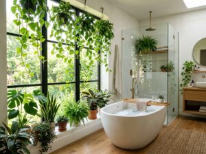
6. Moody Botanical Greens

I’ve always been that person who brings home a new plant every time I go to the grocery store. My husband says our living room is starting to look like a jungle, but I think it’s just healthy! When I was looking at 7 colorful living room designs, I knew I had to include something with green. There is just something about the color green that makes you feel like you can breathe deeper. I remember the first time I painted a wall a really dark forest green. It was in my tiny study, and I was so worried it would look like a dark hole. But once I put some plants against it, it felt like I was sitting in a cozy forest. It’s a very moody look, but in a good way.
Layering Your Shades of Green
One thing I learned from my gardening hobby is that nature doesn’t just use one green. It uses a hundred! So, when you are doing this in your house, don’t feel like everything has to match. I have dark forest green on the walls, but my curtains are a lighter sage color. Then, I have an olive green chair in the corner. Putting all these different greens together makes the room feel “full” and interesting. If you just use one shade, it can look a bit flat, like a chalkboard. I tell my students that variety is what makes things look real. It’s okay if your greens “clash” a little bit—that’s how they look in the wild anyway!
Bringing in the Real Jungle
Of course, you can’t have a botanical room without real plants. I have a big Fiddle Leaf Fig that I’ve somehow kept alive for three years (which is a miracle for me!). The big, waxy leaves look so good against a dark wall. If you aren’t good with plants, you can always use botanical art prints. I have a few old drawings of ferns and flowers in simple frames. They add that “natural” feel without needing to be watered. It’s a great way to fill up empty wall space. Plus, having plants in the room actually helps clean the air, so you are doing something good for your health while you decorate.
Using Metals and Natural Wood
To keep the room from feeling too dark or “heavy,” I like to add some brass or gold. I found these brass wall sconces that look amazing against the green paint. The gold color really pops and makes the room look a bit more fancy. I also use a lot of natural wood, like a reclaimed wood coffee table. The brown of the wood and the green of the walls go together like trees and dirt. It’s a classic combo. If you have a leather sofa, that works great too! The warm brown leather makes the green feel even cozier. It’s the perfect style if you want a room that feels quiet, peaceful, and a little bit mysterious.
7. The Pop Art Primary Palette

When I was a kid, I loved reading comic books. I remember looking at the bright red speech bubbles and the deep blue capes of the superheroes. I never thought I’d use those same colors in my house! But as I looked into 7 colorful living room designs, I realized that the “Pop Art” style is perfect for people who don’t want to take life too seriously. It’s all about using those basic colors—red, yellow, and blue—in a way that feels like a piece of art. I decided to try it in my basement, which used to be really dark and sad. Now, it looks like a scene from a 1960s TV show, and my students think it’s the coolest room I’ve ever shown them.
Why Primary Colors Are So Fun
The best part about this style is that you don’t have to guess what colors match. Red, blue, and yellow always look good together because they are the “parents” of all other colors. I started with a bright red sofa I found at a warehouse sale. It was a huge risk, but it looks amazing! I put a yellow coffee table in front of it and added some blue pillows. It’s a lot of energy, but it makes the room feel so happy. My husband says it feels like living inside a Lego set, and honestly, I don’t think that’s a bad thing at all. It’s much better than a room that feels like a boring doctor’s office.
Using Art as Your Guide
In a pop art room, the art on the walls is the star. I found some cheap prints that look like old comic book pages. They have big dots on them and words like “KABOOM!” or “WOW!” It adds a sense of humor to the house. I also like using furniture that is a bit shiny, like plastic or metal. I have these glossy yellow chairs that are very easy to wipe down, which is great because my kids always have sticky fingers. You don’t need to spend a lot of money to make this work. Sometimes, just painting an old picture frame a bright blue is enough to make it look special.
Adding Black and White for Balance
Since these colors are so loud, you need something to keep them from being too much. I used a lot of black and white. I have a rug with black and white checks, and it helps the red and yellow pop even more. It’s like the black lines in a drawing—it gives the colors a border so they don’t look messy. I also make sure the light bulbs are a nice bright white so the colors don’t look muddy at night. This style might not be for everyone, but if you want your home to be a place where people laugh and feel creative, it’s a great choice. Out of all the 7 colorful living room designs I’ve tried, this one definitely gets the most attention from guests!
Conclusion
Picking out a new look for your home can feel like a big job, but it’s also a chance to show who you really are. These 7 colorful living room designs show that you don’t have to stick to boring colors if you don’t want to. Whether you like the deep feel of jewel tones or the fun energy of pop art, there is a color out there for you. I’ve learned that the more color I add to my house, the happier I feel when I get home from work. Don’t be afraid to make a mistake—paint can always be covered up! The most important thing is that you love where you live.
Did these ideas give you a spark of inspiration? Please share this post on Pinterest so your friends can see these vibrant designs too!