You know that feeling when you walk into a room and it just… hugs you? That’s the power of color! But let’s be real for a second—staring at a hundred paint chips in the hardware store is enough to make anyone want to curl up in a ball and stick with “safe” Magnolia white. I’ve been there. We’ve all been there.
Here’s the thing: your bedroom is the last thing you see at night and the first thing you see in the morning. Why shouldn’t it bring you joy? In fact, interior design trends for 2026 are finally moving away from the “sad beige” era and embracing what experts call “Heritage Maximalism” and “Experience-Driven Design”. It’s not just about slapping paint on a wall; it’s about creating a mood that resonates with your soul. Did you know that blue bedrooms can actually help you sleep longer because the color lowers your heart rate?. Wild, right?
Whether you’re renting and terrified of losing your deposit or you’re ready to drench your walls in the deepest emerald you can find, I’ve got you covered. Let’s dive into 7 colorful bedroom ideas that will turn your sleeping quarters into the vibrant sanctuary you deserve.

1. The “Color Drenching” Technique

I have to be honest with you—I used to be terrified of painting anything other than the walls. For years, I stuck to the “safe” rule: white ceiling, white trim, and maybe a splash of color on the walls if I was feeling adventurous. But then I discovered color drenching, and let me tell you, it completely changed how I look at colorful bedroom ideas.
The first time I tried this, I was shaking in my boots. I had chosen this deep, moody terracotta for my guest room. I painted the walls, and then I stared at the bright white skirting boards and door frame. They stood out like a sore thumb! It just looked… unfinished. That’s when I grabbed the brush and decided to go for it.
Why Paint the Whole Room?
Color drenching is basically taking one color and painting everything—the walls, the trim, the doors, and yes, even the ceiling. It sounds intense, right? But here is the magic: when you remove those white lines that break up the visual field, the room actually feels bigger. The corners disappear, and you get this cozy, hug-like feeling that is perfect for sleep.
I remember thinking my small bedroom would feel like a box. Totally wrong! It actually felt infinite because your eye doesn’t stop at the ceiling line. If you are looking for bedroom paint trends that make a small space feel luxurious, this is it.
A Mistake You Can Avoid
Now, here is where I messed up so you don’t have to. I used the exact same paint can for the walls and the trim. Big mistake. While you want the color to be the same, you need to mix up the finishes to keep it from looking flat.
For the walls and ceiling, stick to a flat or matte finish. It hides imperfections in the drywall (and trust me, my old house has plenty of those). But for the trim, doors, and skirting boards, get the same color mixed in a satin or semi-gloss finish.
Why? Two reasons. First, durability—baseboards take a beating from the vacuum cleaner. Second, the slight shine on the trim catches the light differently than the matte walls. It adds just enough texture so the room doesn’t look like a solid block of clay. It’s a subtle detail, but it makes the room look designed rather than just “painted.”
So, grab that roller and don’t stop at the crown molding. Drench it all!
2. Jewel-Toned Heritage Maximalism

I have to admit, when I first heard the term “Heritage Maximalism,” I scratched my head. It sounded like something only fancy people in magazines did. But then I realized it’s actually just a fancy way of saying: “mix deep, rich colors with stuff that looks like it has a history.” And honestly? It is my favorite way to add personality to a boring bedroom.
If you are tired of everything looking the same, this style is your best friend. It’s not about clutter; it’s about richness. Think of a jewelry box. You want your room to feel precious and a little bit dramatic.
Why “Moody” Doesn’t Mean “Sad”
A lot of folks get scared of dark colors. They think if they paint their walls Emerald Green or Sapphire Blue, the room will feel depressing. I’m here to tell you, it’s the exact opposite. Dark jewel tones are incredibly cozy. They kind of wrap around you.
I painted an accent wall in my own bedroom a deep Navy Blue last year. I was worried it would be too much. But as soon as I put my gold lamp in front of it, the whole room just popped. These colors reflect light in a different way than pastels do. They create shadows and depth that make you want to curl up with a good book. It feels safe, not sad.
Mixing the Old with the Bold
You don’t need to go out and buy expensive antiques to get this look. The “Heritage” part just means adding things that feel established. I found a dark wood nightstand at a yard sale for twenty bucks. It was scratched up, but that just added to the charm.
Pairing that dark wood with a bright, jewel-toned duvet—like a rich Ruby Red or Amethyst—creates a contrast that looks amazing. If you have modern furniture, you can still pull this off. Just add some vintage-looking accessories. A heavy velvet curtain or a brass mirror can instantly give you that “old world” vibe without making your room look like a museum.
Don’t Forget the Shine
Since these colors are heavy, you need something to break them up. That is where metallic accents come in. Gold, brass, or copper fixtures are essential here.
I swapped out the cheap plastic handles on my dresser for some heavy brass ones I ordered online. It took me ten minutes, but it made the whole dresser look like it belonged in a castle. When the light hits those metal accents against a dark blue or green wall, it sparkles. It’s a small trick, but it makes the room feel finished and expensive, even if you did it all on a tight budget.
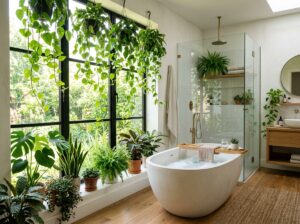
3. Biophilic Greens & Earthy Sanctuaries

You know that feeling when you take a walk in the woods and your shoulders just kind of… drop? Like all the stress you didn’t even know you were holding just floats away? That is exactly what we are trying to capture with this style. It’s called “biophilic design,” which is just a big word for “loving nature,” but I just call it making my room feel like a sanctuary.
I used to think green walls would look like I was sleeping in a swamp. I was so wrong. The trick is picking the right green. We aren’t talking about neon lime here. Think about the colors you see on a hike—moss on a rock, dried sage leaves, or the deep dark green of a pine tree.
Finding Your Perfect Shade
When I decided to try this, I grabbed about ten different paint chips. I taped them to the wall and watched them for a few days. This is super important because green changes a lot depending on the light. In the morning, a color might look fresh and minty, but at night under a lamp, it could turn muddy.
I settled on a soft Sage Green for my walls. It is honestly the most calming color I have ever lived with. It acts like a neutral. You can put almost anything against it—white, gray, wood—and it looks good. If you want something moodier, a deep Forest Green behind your bed looks incredible and makes the room feel like a cozy den.
Texture is the Secret Sauce
Here is the thing about nature: nothing is perfectly smooth. Trees have bark, rocks are rough, and leaves have veins. So, if you paint your walls green but keep everything else shiny and plastic, it feels weird. You have to bring in natural textures to make it work.
I swapped out my metal blinds for bamboo shades, and the difference was huge. It instantly added warmth. I also love using linen bedding with this look. Linen is a bit wrinkly, and that’s the point! It feels organic and real. Throw in a woven rattan chair or a jute rug, and suddenly your bedroom doesn’t feel like a showroom; it feels like a retreat.
Bringing Life Inside
You can’t talk about this style without talking about plants. They are the ultimate “living” decor. Now, I know what you’re thinking—”Youssef, I kill everything I touch.” I hear you. I’ve sent many ferns to an early grave.
But you don’t need to be a gardener to make this work. Start with a Snake Plant or a Pothos. I swear, those things are impossible to kill. I have a Pothos on my dresser that I forget to water for weeks, and it just keeps growing. The green leaves against the green walls create this layered, lush look that makes the air feel fresher. It’s a small change that makes a massive impact on how you sleep.
4. The “No-Paint” Pop (Renter Friendly)

I remember my first apartment like it was yesterday. It had these stark, hospital-white walls, and my landlord, Mr. Henderson, made it very clear: “If you paint, you pay.” I was terrified of losing my deposit, so for two years, I lived in a beige box. It was miserable. I wish I knew then what I know now—you don’t need a single drop of paint to have a colorful bedroom.
If you are renting or just scared of commitment (it happens!), this section is for you. We are going to cheat the system. The goal is to cover as much of that boring white space as possible with things you can take with you when you move.
Textiles Do the Heavy Lifting
Since you can’t change the walls, you have to change everything else. And the biggest impact comes from your bed. It’s the biggest piece of furniture in the room, right? So, if your duvet is white or gray, you are missing a huge opportunity.
I recently helped my niece with her dorm room. We bought a massive, bright yellow duvet cover with big pink flowers. Immediately, the room felt cheerful. We didn’t stop there. We got floor-to-ceiling velvet curtains in a deep teal color. When you close them, it’s like an entire wall of color just appeared. It distracts your eye from the boring paint. Plus, heavy curtains block out light better, so you sleep better. It’s a win-win.
The Magic of “Peel and Stick”
Okay, technology has come a long way since the contact paper of the 90s. Removable wallpaper is a total game-changer for renters. I was skeptical at first. I thought it would peel off the paint or look cheap. But I tried a mural on the wall behind my headboard, and it looked like a professional did it.
The trick is to just do one wall. Pick a pattern that makes you happy—maybe a jungle print or a geometric design. It acts like a giant piece of art. And the best part? When it’s time to move, you just peel it off. No scraping, no sticky mess. It takes about an afternoon to put up, and it completely transforms the vibe.
Don’t Ignore the Floor
A lot of rentals have questionable carpeting. You know the kind—that weird, speckled brown stuff that hides stains but looks sad. Cover it up!
Get the biggest area rug you can afford. I’m talking 8×10 or larger if it fits. A rug creates a “room within a room.” I found a Persian-style rug with deep reds and blues at a discount store, and it anchored my space perfectly. It adds texture and color from the ground up. Suddenly, you aren’t looking at the beige carpet anymore; you are looking at this beautiful pattern that feels like home.
5. Soft Clay & Warm Terracotta Retreats

For a long time, everything in home design was gray. Gray walls, gray sofas, gray rugs. It felt clean, but after a while, it started to feel a little cold to me. I realized I didn’t just want my bedroom to look clean; I wanted it to feel like a warm hug at the end of a long day. That is where these soft clay and terracotta colors come in.
I think of this style as “grounded.” It’s not loud or flashy. It reminds me of the color of the earth or a sunset right before it gets dark. Painting your walls in these baked-earth tones changes the whole temperature of the room. It instantly feels cozier, like you are wrapped in a favorite blanket.
It’s Not Just “Pink”
When I first suggested a “clay” color to my friend for her master bedroom, she looked at me like I was crazy. “I don’t want a pink bedroom, Youssef!” she said. But here is the difference: these colors have brown and orange undertones. They aren’t candy-colored. They are dusty and muted.
Think of the color of a terracotta flower pot or dried plaster. When you put this on the walls, it doesn’t scream at you. It just glows. Especially in the evening. When you turn on a lamp with a warm bulb, these walls reflect a light that makes everyone look good. It is incredibly flattering and soothing. If you struggle to wind down at night, this color palette is a great choice because it mimics the natural light of the evening sun.
Mixing Tones for Depth
You might worry that painting a room brown or orange will look like the 1970s. The trick to keeping it modern is to layer different shades of the same color family. I love seeing a deep terracotta wall paired with lighter, dusty pink bedding.
You can even throw in a little mustard yellow or rust. Since all these colors are “warm,” they get along nicely. It creates a look that is interesting but not chaotic. I have a clay-colored throw blanket on my beige chair, and it just wakes the whole corner up without being too loud.
Soft Textures for a Soft Look
Because these colors are so earthy, they look best with materials that feel natural too. Shiny plastic or cold metal can look a bit harsh next to soft clay walls. Instead, look for fabrics that have some nubby texture to them.
Bouclé is huge right now—that’s that loopy, bumpy fabric that looks like a sheep’s coat. A cream-colored bouclé pillow against a terracotta duvet is a match made in heaven. I also love using matte pottery for decor. A simple unglazed vase on the nightstand fits the vibe perfectly. It keeps that chalky, soft feeling going throughout the whole room. It’s about creating a space that feels soft to the touch, not just soft to the eye.
6. The “Fifth Wall” Surprise (Ceiling Accents)

I have to tell you a secret: for most of my life, I completely ignored the ceiling. I treated it like the sky—it was just there, usually white, and I never really looked at it. But in the design world, we call the ceiling the “fifth wall.” And honestly? Ignoring it is like wearing a great outfit but forgetting to brush your hair. It’s a missed opportunity!
When I first decided to paint a ceiling, my wife looked at me like I had lost my mind. “Youssef,” she said, “nobody looks up there.” But that is exactly the point. When you do look up and see a splash of color, it is a delightful surprise. It changes the whole feeling of the room without taking up any floor space.
Why Mess with the Ceiling?
The biggest myth I hear is that painting a ceiling a dark color will make the room feel small or claustrophobic. Actually, it can do the opposite. If you have high ceilings, a dark color like charcoal or navy brings the ceiling down visually, making the room feel cozy and intimate. It stops the room from feeling like a gymnasium.
On the flip side, if you paint the ceiling a light, bright color—like a pale sunny yellow or a soft sky blue—it can trick your eye into thinking the room is airy and open. I painted the ceiling in our guest room a soft powder blue, and now when guests wake up, they say it feels like waking up under the open sky. It’s a cheap trick, but it works wonders.
Wallpaper Isn’t Just for Walls
If you are feeling brave (and have a sturdy ladder), putting wallpaper on the ceiling is a total showstopper. I am not going to lie to you—it is a bit of a workout. My neck was sore for two days after helping my neighbor put up a floral wallpaper on her ceiling. But the result? Incredible.
It turns your bedroom into a jewelry box. Since the walls were plain, the patterned ceiling became the art. It draws your eye up immediately. If you try this, just make sure you have a friend to help you. Wrestling sticky paper over your head is not a one-person job, trust me.
Lighting Makes It Pop
The best part about a colorful ceiling is what it does to your light fixtures. If you have a white ceiling and a crystal chandelier or a cool brass pendant, it can kind of get lost in the glare. But against a saturated color? It pops!
I have a simple drum shade light fixture. Against white, it was boring. But after I painted the ceiling a warm mustard tone, that light fixture suddenly looked modern and cool. The contrast makes your lighting look more expensive than it actually is. So, next time you have a paintbrush in hand, look up. The fifth wall is waiting for you.
7. Moody Monochromatic Blues

When I was growing up, blue was just… blue. You had your basic boy’s bedroom blue and maybe a navy blazer. But lately, I’ve fallen completely in love with the idea of a monochromatic blue bedroom. It sounds fancy, but “monochromatic” just means using different shades of the same color. And let me tell you, it creates a vibe that is hard to beat.
There is a reason why blue is the most popular color in the world. It’s the color of the ocean and the night sky. It calms us down. In 2026, we are seeing a huge move towards these deep, moody blues for the bedroom, and I am here for it. It’s not just about looking good; it’s about sleeping better.
Why Darker is Better for Sleep
I used to think a bright, white bedroom was the best way to wake up. But I found that I actually struggled to fall asleep because the room felt so… energetic. When I painted my walls a dark Indigo, everything changed.
Dark colors absorb light instead of bouncing it around. This creates a “cave-like” feeling that naturally signals your brain that it is time to rest. It feels like the room is giving you a hug. If you work a stressful job or just have a busy brain like me, walking into a dark blue room instantly lowers your blood pressure. It’s like hitting a reset button.
Layering is Key
Now, you don’t want the room to look flat. If you paint the walls navy and then buy a navy bedspread that is the exact same shade, it might look a little boring. The secret is to mix it up.
Think about the ocean. It’s not just one color. It’s teal, sapphire, sky blue, and deep midnight blue all mixed together. Try to do the same in your room. I have dark navy walls, but my sheets are a lighter, dusty blue, and I have a throw pillow that is almost a blue-gray. This layering gives the room depth. It makes your eyes move around and notice different textures. It feels rich and designed, even if you just bought things from different stores over time.
Adding a Little Sparkle
Because there is so much blue, you need something to wake it up a little bit so it doesn’t feel too heavy. White is an easy choice—crisp white trim or fluffy white pillows look amazing against dark blue. It looks very nautical and classic.
But if you want something a bit warmer, go for gold or brass. I have a brass reading lamp next to my bed, and the way the warm metal looks against the cool blue wall is just stunning. It adds a little bit of luxury. It stops the room from feeling like a boys’ dorm and makes it feel like a grown-up sanctuary. Just a few shiny accents are all you need to balance out the moodiness.
Conclusion: Your Color Journey Starts Now
We have covered a lot of ground today, haven’t we? From drenching your walls in deep clay tones to looking up at a bright yellow ceiling, I hope your head is spinning with ideas. I know mine always does after looking at paint charts!
I want to leave you with one final thought before you rush off to the hardware store. It is easy to get stuck in the “what if” phase. What if I pick the wrong blue? What if the green looks like spinach? What if I hate it in a month? I see this “analysis paralysis” all the time, not just in my classroom but with my friends who are trying to fix up their homes.
Perfection is Boring
Here is the truth: it is just paint. It is just a rug. It is just a duvet cover. None of this is permanent. The biggest mistake you can make is doing nothing because you are scared of making a mistake.
I remember staring at my own bedroom walls for three years. Three years! They were this dirty beige color left over from the previous owner. I hated them every single day. But I was so afraid of picking the “wrong” color that I lived with a color I knew I didn’t like. That doesn’t make any sense, does it? The day I finally slapped that first coat of Sage Green on the wall, I felt this huge weight lift off my shoulders. Even if it wasn’t perfect, it was mine.
Start Small, But Start
If you are feeling overwhelmed by all these colorful bedroom ideas, just pick one. You don’t have to do the whole “Heritage Maximalism” thing overnight. Start with a pillow. Or maybe paint just the trim. See how it makes you feel.
Your bedroom is the last thing you see before you close your eyes and the first thing you see when you wake up. It should make you smile. It should feel like you. Whether that means a dark, moody cave or a bright, plant-filled greenhouse, you deserve a space that recharges your batteries.
So, go make a mess. Test some samples. Break some rules. And most importantly, have fun with it. Your home is a reflection of you, so let it shine!
P.S. Did you find an idea here that sparked some inspiration? Save this article to your “Dream Home” or “Bedroom Decor” board on Pinterest so you can find it easily when you are ready to start painting!