Did you know that high-contrast “tonal decorating” is predicted to be a standout trend for 2026, proving that limits actually breed creativity? I used to think a monochrome palette would feel cold or boring, but after experimenting with textures, I’ve realized it’s actually the secret to a high-end look! It is not just about painting walls white; it is about balancing light, shadow, and materials to create a space that feels truly alive. Whether you are chasing the clean lines of “soft minimalism” or the drama of a moody den, this classic duo is surprisingly versatile. In this guide, we will explore 7 black and white living room designs that show exactly how to master this timeless aesthetic in your own home. Let’s dive in and transform your space!

1. The “Soft” Minimalist: Japandi Meets Monochrome

I used to think that minimalism meant having an empty room with just one uncomfortable chair and a cactus. It felt cold and uninviting, honestly. But as we move into 2026, the trend has shifted completely to what designers are calling “Soft Minimalism.” This is where the Japandi style—a mix of Japanese rustic warmth and Scandinavian functionality—really shines. It takes the classic black and white color palette but strips away the sharp edges. Instead of feeling stark, the room feels like a deep breath. It is calm, organized, and super cozy. If you want a living room that looks clean but still feels like a home where you can actually take a nap, this is the style for you.
Ditch the Hospital White
The biggest mistake I see people make with this look is grabbing a can of “pure white” paint. Please, don’t do that! Pure bright white can make your living room feel like a dentist’s office. It reflects too much light and feels sterile.
Instead, you want to look for “off-whites” or creams. I always tell my friends to look at colors like “Swiss Coffee” or “Alabaster.” These shades have warm undertones—a tiny bit of yellow or beige mixed in—that you might not notice on the chip, but they make a huge difference on the wall. They soften the contrast so the black accents don’t look too aggressive.
Black is the “Eyeliner” of the Room
In this style, black is not the main event; it is the definition. Think of it like using eyeliner. You don’t cover your whole face in it; you just use a thin line to make your eyes pop.
To get this right, focus on furniture with thin, clean lines. A coffee table with slender matte black metal legs is perfect. Or maybe a black floor lamp with a simple silhouette. These touches “ground” the airy space. If you have a room full of light colors, it can sometimes feel like everything is floating away. A few black accents anchor the room and give your eyes a place to rest.
Texture is Your Best Friend
Since we aren’t using a bunch of crazy colors, we have to make the room interesting in other ways. This is where texture comes in, and frankly, it is the most important part. If everything is smooth and flat, the room will look boring.
You want to mix materials that feel different to the touch. I am seeing a lot of nubby fabrics, like bouclé, on sofas and armchairs. A cream bouclé sofa looks incredible next to a smooth, matte black side table. Also, don’t forget wood! Even though we are talking about black and white, adding light oak wood—maybe in the form of wall slats or a wooden bench—is a hallmark of Japandi style. It adds a natural element that warms up the monochrome theme instantly.
2. Modern Luxe: High-Contrast Glamour

If you want a living room that feels like a five-star hotel suite or a fancy New York penthouse, this is the look for you. I remember walking into a friend’s apartment years ago—she didn’t have much furniture, but the way she mixed black, white, and gold made the whole place look incredibly expensive. That is the power of “Modern Luxe.” It is timeless, bold, and honestly, a lot easier to pull off than people think. You don’t need a million dollars; you just need to know how to fake it with the right materials.
Marble and Stone Make the Statement
Nothing screams luxury quite like marble. In a black and white room, you want stone that has high contrast. I love the look of a white marble coffee table with thick, heavy black veins running through it. It acts like a piece of art right in the middle of the room.
If real marble is out of the budget, don’t worry. There are so many great quartz or even laminate options now that look just like the real thing. I actually used a faux-marble contact paper on an old side table recently, and nobody could tell the difference! You could also go the opposite route with a black stone accent wall or fireplace. It adds a deep, moody vibe that anchors the room, giving your eye something substantial to look at.
Gold is the Jewelry of the Room
A strictly black and white room can sometimes feel a bit cold or sharp. To fix this, I always tell people to bring in warmth with metallics. Gold or brushed brass works perfectly here.
Think of these metal accents as the jewelry for your living room. You wouldn’t wear a fancy black dress without some earrings, right? The same rule applies here. Swap out your cabinet handles for brass ones, or get a side table with gold legs. Just be careful not to overdo it. You want “pops” of gold, not a gold mine. A little bit goes a long way to break up the monochrome and add that sophisticated glow.
Lighting That Steals the Show
In a luxury theme, your light fixtures are not just there to help you see in the dark. They are major decor pieces. I am a huge fan of large, sculptural chandeliers for this style.
Imagine a massive, black, spiky chandelier hanging against a crisp white ceiling. It looks stunning. Or, go for something with crystal details if you want that extra sparkle. The goal is to draw the eye up. When you have a statement light, it makes the whole room feel grander and taller. It is one of those tricks that designers use to make a regular-sized room feel like a mansion.
3. The Gallery Room: Art-First Design

I have always loved walking through art museums. There is something so calming about a stark white room where the only thing demanding your attention is the art itself. It feels quiet and important. Recently, I realized you can totally recreate that “curator” vibe in your own living room. This design style isn’t really about the couch or the rug; it is about treating your walls like a canvas and letting your decor tell a story. If you are someone who collects prints, takes a lot of photos, or just loves visual drama, this is the layout you should try.
Create a Floor-to-Ceiling Gallery Wall
The centerpiece of this look is the gallery wall. But here is the trick to keeping it chic instead of messy: consistency. In a black and white room, you can’t just throw up a mix of random wooden and metal frames. It looks cluttered.
I learned this the hard way. I used to have a wall full of mismatched frames, and it just looked chaotic. The fix? I spray-painted every single frame matte black. Suddenly, it looked intentional. For the “Gallery Room” look, you want a grid or a structured layout of black frames with crisp white matting. And don’t be afraid to go big. I love the look of photos going almost all the way from the floor to the ceiling. It draws the eye up and makes your ceilings look way higher than they actually are. Stick to black and white photography—it unifies everything, so a photo of your dog can sit right next to a fancy landscape, and they still look like they belong together.
Furniture That Looks Like Sculpture
Since the walls are doing a lot of the talking, your furniture needs to be quiet but bold. We are seeing a huge shift in 2026 toward what designers call “fat furniture” or curved shapes.
Think about a chunky, curved white sofa that sits low to the ground. It doesn’t have sharp corners or busy patterns. It acts almost like a sculpture sitting in the middle of the room. When you choose solid white furniture for this style, it pops against the black frames on the wall without fighting them for attention. It feels modern and keeps the focus on the art, which is exactly where you want it.
Don’t Fear the Empty Space
The most important rule for an art-first room is knowing when to stop. We call this “negative space.” It is just a fancy way of saying “leave some wall empty.”
If you cover every single inch of your walls with stuff, your eyes won’t know where to rest, and you will feel anxious instead of relaxed. You need those blank white areas to let the art breathe. I always tell people to pick one or two main walls for art and leave the others mostly bare. It creates balance. This style is perfect for showing off your personality, but remember, a true gallery is carefully edited. You want your guests to stop and look, not just feel overwhelmed by clutter.
4. Industrial Edge: Raw and Refined

I have always had a soft spot for that “New York Loft” look. You know the one—big open spaces, exposed pipes, and a vibe that feels a little bit gritty but totally cool. It reminds me of those trendy coffee shops where you pay six dollars for a latte, but you don’t mind because the atmosphere is just that good. This style, which we call “Industrial Edge,” is perfect for a black and white theme because it relies on raw materials rather than bright colors to make a statement. It’s masculine, tough, and durable, which is great if you have kids or pets running around who might wreck delicate furniture.
Black Frames Frame the View
The absolute superstar of this look is the window. If you are lucky enough to have big windows, or even just regular sliding glass doors, painting the frames matte black is a game changer.
I did this in my own den last year. The frames were originally a boring beige aluminum, and they just disappeared into the wall. I grabbed some special metal paint and turned them black. Instantly, the windows looked like picture frames. It draws your eye straight to the outside view. In an industrial living room, these black lines mimic the look of old factory windows. It adds a structural, architectural feel to the room without you having to knock down any walls. It is a simple weekend project that makes a massive impact.
The Brick Debate: White or Charcoal?
If you have exposed brick, you are already halfway there. But in a monochrome room, red brick can sometimes clash. This is where paint comes in.
For a cleaner, brighter industrial look, I love painting the brick white. It keeps all that bumpy, interesting texture—which is exactly what we want—but it quiets the color down. It feels fresh and open. However, if you want something moodier, maybe for a “man cave” or a cozy evening room, painting the brick charcoal grey or soft black is incredible. It makes the furniture pop. I saw a living room recently with a black brick wall and a tan leather couch (okay, not strictly black and white, but close!), and it looked so cozy. For a strict black and white palette, a dark grey wall adds depth that plain drywall just can’t give you.
Heavy Metals and Worn Textures
Since we aren’t using color, we need materials that have a “story.” Industrial design is all about mixing metal and leather.
Avoid anything that looks too shiny or perfect. You want matte black metal shelving units—the kind that look like they belong in a warehouse. Pair that with a black leather sofa. And here is a tip: distressed leather is better. If it has a few scratches or looks a bit worn, it adds to the vibe. It stops the room from feeling like a museum. I also like using raw concrete for coffee tables or even floors if you can. It’s cool to the touch and adds a literal “street” element to your living room that balances out soft throws or rugs.
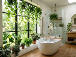
5. Boho Monochrome: Pattern Play and Greenery

I used to think Bohemian style meant an explosion of purple, orange, and turquoise. You know, that “hippie” look from the 70s. But recently, I have fallen in love with “Boho Monochrome.” It is basically taking that relaxed, free-spirited vibe and filtering it through a black and white lens. It stops the room from looking messy and makes it look grown-up. If you want a space that feels lived-in and comfortable—where you can put your feet up without worrying about ruining a perfect pillow—this is the design for you. It proves you don’t need bright colors to have a fun personality in your home.
Global Patterns are Essential
Since we aren’t using color to grab attention, we have to use patterns. In a Boho room, this usually means looking for global or tribal prints. My absolute favorite thing to use here is a Beni Ourain style rug. These are those fluffy Moroccan rugs that are white with simple black geometric diamonds on them. They are so soft under your feet and instantly set the mood.
You can also look for “mud cloth” pillows. These are usually made from thick, hand-dyed cotton and have imperfect white symbols painted on black fabric (or vice versa). I love them because they don’t look machine-made. They look like they traveled from far away to be in your living room. Mixing these jagged, geometric shapes creates movement, so the room doesn’t feel stiff or stuck in place.
The “Pop” of Green
Okay, I know I said this was a black and white room, but in the Boho look, we cheat a little bit. The only color allowed is green—specifically, plant green.
Plants are magic in a monochrome space. When you put a big, leafy Monster or a Fiddle Leaf Fig next to a black wall or a white chair, the green looks electric. It looks so much brighter than it would in a colorful room. I always tell people to go big here. Don’t just buy one tiny cactus. Get a tall plant that reaches toward the ceiling. It adds life. Without plants, a black and white Boho room can look a little sad. The greenery reminds you that people (and living things) actually live there.
Layering to Soften the Look
The danger with black and white is that it can look sharp and cold. Boho is all about being “soft.” To fix this, you need to layer your textures.
I am talking about macramé wall hangings made of cotton rope, woven baskets for storing blankets, and chunky knit throws draped over the sofa. I recently hung a cream macramé swing chair in a corner of a room I was helping with, and it became the best seat in the house. These natural materials—usually in shades of cream, tan, or light wood—bridge the gap between the stark black and the bright white. They make the room feel warm and cozy, like a hug, rather than a cold art gallery.
6. Classic Traditional: Stripes and Moldings

When I say “Traditional,” I don’t want you to picture a dusty room filled with old furniture you aren’t allowed to sit on. Think more like a chic Parisian apartment. You know the kind I mean? High ceilings, fancy details on the walls, but it still feels cool and updated. This style is making a huge comeback in 2026 because people are craving homes that feel established, like they have been there for a hundred years, even if the house was built in 2010. It is about mixing that old-world elegance with a strict black and white palette to make it feel fresh.
The Walls Are the Decoration
In a traditional room, the walls shouldn’t just be flat drywall. You need some architecture. If your home has crown molding or wainscoting (that fancy wood paneling on the lower half of the wall), you are lucky!
To make this look modern, I love the idea of using high contrast on the trim. Usually, people paint the walls a color and the trim white. But try flipping it, or just highlighting the architecture. I recently saw a living room where the homeowners painted the wainscoting a deep, satin black and kept the upper walls crisp white. It looked incredible. It framed the furniture perfectly. If you don’t have moldings, you can actually buy “box molding” kits from the hardware store and glue them up. Once you paint over them, nobody knows they weren’t original to the house. It adds a layer of history that flat walls just don’t have.
Stripes and Checkerboards
Since we aren’t using bright florals or crazy colors, we need a pattern that screams “classic.” Nothing does that better than stripes or a checkerboard.
A black and white striped armchair is like the white t-shirt of interior design—it never goes out of style. It looks sharp and tailored. If you are feeling a bit braver, the checkerboard pattern is huge right now. I am not saying you have to rip up your floors and put in black and white tiles (though that looks amazing). You can get the same vibe with a large area rug. A checkerboard rug under a glass coffee table anchors the room and gives it that vintage, expensive feel without trying too hard. It’s a bold move, but in black and white, it rarely looks bad.
Symmetry Brings the Calm
Have you ever walked into a fancy hotel lobby and felt instantly relaxed? That is usually because of symmetry. Traditional design loves pairs.
Our brains really like it when things match on both sides. To get this look, try buying two identical black armchairs and placing them across from your sofa. Or put matching black lamps on either end of a white console table. When you mirror things, it makes the room feel formal and “finished.” It stops the space from feeling cluttered because your eye knows exactly where to look. It is a simple trick, but it creates that sense of order and balance that traditional design is famous for.
7. The “Moody” Dip: Color Drenching in Black

For a long time, we were told that small rooms had to be painted white to feel bigger. I used to believe that too. But recently, there has been a huge shift toward what designers call “Color Drenching,” and honestly, it is one of the coolest things I have seen. This style flips the script. Instead of white walls with black accents, you paint the whole room black. I know, it sounds a little scary! You might think it will feel like a cave. But if you do it right, it actually feels incredibly cozy and intimate, like a warm hug. It is becoming super popular for media rooms or dens where you want to curl up and relax.
Paint It All: Walls, Trim, and Ceiling
If you are going to commit to the dark side, you can’t go halfway. The secret to “Color Drenching” is that you paint everything the same color. And I mean everything—the baseboards, the window trim, the walls, and yes, even the ceiling.
When you paint the ceiling the same dark color as the walls, something magic happens. The corners of the room kind of disappear. You can’t tell where the wall ends and the ceiling begins, so the room actually feels infinite rather than small. I suggest using a “soft black” rather than a harsh, jet black. Look for colors that have a little bit of blue or brown in them. It feels softer on the eyes. It creates this blurry, dream-like vibe that is perfect for watching movies or reading a book.
The “Pop” of White
Since the “envelope” of the room is dark, your furniture needs to provide the contrast. This is where you bring the white back in.
A stark white modern sofa looks absolutely amazing against a black wall. It practically glows. I saw a living room recently that had charcoal walls and a bright white rug, and the rug looked like a spotlight in the middle of the room. It draws your eye to the center and stops the room from feeling too heavy. You can also use light grey or even cream, but bright white gives you that sharp, high-definition look that feels very 2026.
Lighting is Everything
Okay, this is the most important part. If you have a black room and bad lighting, it will just look like a dungeon. You have to be smart about how you light it.
Please, I am begging you, do not use the big overhead light! It will flatten everything out. Instead, you need “pools” of light. Use floor lamps in the corners and table lamps next to the sofa. You want the light to glow against the dark walls. Also, make sure you use warm light bulbs (look for 2700K or 3000K on the box). Cool, blueish light in a black room looks like a creepy interrogation room. Warm light makes the black paint look rich and velvety. It turns the room into a moody, cinematic escape that you won’t want to leave.
Conclusion
So, there you have it. We made it through seven totally different ways to rock a black and white living room without it feeling boring or repetitive. I hope this list showed you that sticking to just two colors doesn’t mean you are stuck in a box. In fact, it is kind of the opposite. When you take away the stress of matching a bunch of different colors, you actually get more freedom to play with fun stuff like lighting, funky furniture shapes, and cool art.
Whether you fell in love with the bright, airy Japandi look or you are brave enough to try the dark, moody walls, the key is just to start. Don’t overthink it. Remember, the secret sauce in a monochrome room is always texture. If the room feels flat, throw in a fuzzy blanket, a wood table, or a shiny metal lamp. It really is that simple.
If you found these ideas helpful, do me a huge favor! Save this article to your “Home Decor 2026” board on Pinterest. It helps other people find these tips, and you will have them saved for when you are finally ready to buy that paint!