When I first moved into my current place, I spent weeks staring at the living room. I thought the problem was my sofa. It felt too big, or maybe just too boring? I actually wasted a whole Saturday driving to different furniture stores, looking for that one magic piece that would fix the room.
Turns out, I didn’t need to buy a single thing. I just needed to pull the sofa away from the wall.
It’s funny how we always think we need to buy new stuff to make a room look better. But 87% of interior designers agree that the layout—where you actually put things—is way more important than the furniture itself. I honestly believe that. I’ve seen huge rooms feel cramped because everything was pushed to the edges, and I’ve seen tiny apartments feel open just because the flow was right.
In this post, I’m going to walk you through 7 room layout ideas that I’ve learned after a lot of trial and error (and plenty of scratched floors). We aren’t going to do anything complicated. We’re just going to look at your space differently. Whether you’re dealing with a weird L-shaped room or a boxy bedroom, we can fix the flow so your house finally feels like home.

1. Anchor Your Space with the “Floating” Furniture Layout

I honestly think this is the hardest mental block to get over. When we look at an empty room, our instinct is to push the sofa against one wall and the chairs against the other. We think, “Look at all this floor space I have now!” But ask yourself, what are you actually doing with that big empty space in the middle? Unless you host nightly dance parties or wrestling matches, that space is basically wasted.
Floating your furniture means pulling it away from the walls. It sounds counterintuitive, right? Especially if you have a smaller living room. But when you pull things in, you stop focusing on the walls and start focusing on the people in the room. It makes the whole place feel intentional, not just like a waiting room where everyone sits in a line staring at the center.
The “Cozy Huddle” Effect
Think about when you’re at a party. People don’t stand in the corners shouting across the room; they huddle in the middle. Your furniture should do the same. By bringing your seating closer together, you create a cozy conversation area. I remember doing this in my den, which felt super awkward and long. Once I pulled the loveseat off the wall, suddenly it felt like a proper room. You want your guests to be able to talk without raising their voices. It creates a sense of intimacy that you just can’t get when everyone is plastered to the perimeter.
Don’t Forget the Anchor
Now, there is a catch. You can’t just leave your furniture floating in the middle of a bare floor. It’ll look like a raft lost at sea. You need something to tie it all together, and that is where the area rug comes in. The rug acts as an island.
A good rule of thumb I tell my friends is that at least the front legs of all your seating should sit on the rug. If the rug is too small, the floating layout looks messy. It needs to feel grounded. If you get a nice, big rug, it visually claims that territory and tells your brain, “Okay, this is the living zone.”
Improving the Traffic Flow
Another great thing about floating your furniture is that it fixes your traffic problems. When furniture is against the wall, you often have to walk through the conversation area to get to the other side of the room. That’s annoying if someone is watching TV or trying to talk.
When you float the furniture, you create a walkway behind the sofa or chairs. This directs traffic around the social zone, not through it. It keeps the energy of the room calm because people aren’t constantly cutting across your view. It takes a little bravery to try it, but trust me, give it a shot for a week and see how it feels.
2. Define Distinct Zones in Open-Concept Areas

I remember when “open concept” became the huge thing a few years back. We all wanted to knock down our walls thinking it would make our houses look massive. And yeah, it looked great for about five minutes. Then I realized I was basically living in a loud cafeteria.
Without walls, everything just bleeds together. You’re cooking dinner, the noise is competing with the TV, and toys are drifting into the kitchen. It is chaotic. I learned the hard way that you have to create invisible walls if you don’t have real ones to keep your sanity.
Use Your Sofa as a Wall
This was a total game-changer for me. In my old apartment, I had the sofa pushed back against the wall, facing the kitchen. It made the room feel like one giant, confused hallway.
I turned the sofa around so its back faced the dining area. Boom. Instant separation. It created a physical barrier that told my brain, “Okay, the living room stops here.”
If the back of your couch is ugly (we’ve all been there), stick a console table behind it. I put a lamp and some books on mine. It creates a visual edge that stops the eye. It defines the living space without closing it off completely.
Rugs Are Your Best Friend Here
I can’t stress this enough: rugs are the easiest way to zone a room. In a big open floor plan, you need multiple rugs to make sense of the space.
Think of them as little islands. The dining table gets a rug. The sofa and chairs get a separate rug. The strip of bare floor between them? That’s your hallway.
When I first tried this, I made the mistake of buying rugs that were too small. It looked like postage stamps on an envelope. You need a rug big enough that the furniture actually sits on it. It anchors the zone and separates it from the rest of the house.
Light It Up Differently
Another trick I use is lighting. In a big boxy room, overhead lights just flatten everything out and make it feel cold.
I set up a floor lamp by the reading chair and a pendant light over the dining table. When you turn off the big overheads and just use the lamp, you create a little pool of light. It focuses your attention on just that one spot. It makes a big cavernous room feel like a bunch of cozy little rooms.
3. Master the Symmetrical Layout for Instant Balance

I used to think that matching furniture was super boring. In my twenties, I tried really hard to be “eclectic.” I’d buy one weird chair and a different lamp and throw them in a room, thinking I was being artistic. But honestly? It just looked messy. It felt like a garage sale exploded in my living room.
As I got older, I realized why people love symmetry. It isn’t about being boring; it is about being calm. Our brains naturally look for patterns. When you walk into a room and see two matching lamps on either side of a sofa, your brain goes, “Ah, okay, I understand this.” It relaxes you immediately.
Why Symmetry feels so Good
Think about a human face. It’s symmetrical (mostly). We find that beautiful. The same goes for rooms. If you have a fireplace or a big window, that is your center line.
I tried this in my front sitting room last year. I bought a second armchair that matched the one I already had. I placed them facing each other with the coffee table in the middle. The difference was crazy. Suddenly, the room felt “finished.” It felt balanced. If you are the kind of person who gets stressed out by clutter or chaos, a symmetrical layout is basically free therapy.
Where to Use It
You don’t need to do this in every room—that would look weird. But it works perfectly in two specific spots:
- The Master Bedroom: This is the easiest place to start. Put the bed in the middle, and get matching nightstands and matching lamps. It creates a frame around the bed and makes the room feel like a hotel suite.
- Formal Living Areas: If you have a room where you mostly sit and talk (no TV), symmetry is king. Two sofas facing each other is the classic move here. It encourages conversation because nobody is fighting for the “good seat.” All the seats are the good seats.
Don’t Make It a Museum
Now, you have to be careful. If everything matches perfectly, your house is going to look like a furniture showroom. You don’t want people to be afraid to sit down.
The trick I learned is to have 90% symmetry and then break it on purpose. Keep the sofas and lamps matching, but then throw a weird, colorful blanket on just one side. or put a plant in one corner and a floor lamp in the other. That little bit of imbalance stops things from feeling too stiff. It keeps the room feeling alive.
4. Utilize the “L-Shape” Configuration for Corner Efficiency

Corners are tricky. In my first house, I had this weird empty corner that I just filled with a fake plant because I didn’t know what else to do. It collected dust and felt like wasted space. That is until I figured out the L-shape layout.
Basically, this layout uses two perpendicular walls to anchor the furniture. It is perfect if you have a smaller room where you can’t really “float” furniture in the middle because you would trip over it. By tucking things into the corner, you open up the rest of the floor for walking or for kids to play.
The Magic of the Sectional
The easiest way to get an L-shape is with a sectional sofa. A lot of people are scared of sectionals because they look huge in the store. But in a small room, one big piece of furniture actually makes the room look bigger than three small pieces.
Think about it. If you have a regular sofa and two chairs, you have gaps between them. You lose space to the arms of the chairs and the little side tables you have to squeeze in. An L-shaped sectional creates a solid block of seating. You can pile a whole family on there for movie night. I swapped out my sofa and chair combo for a sectional last year, and suddenly my narrow living room felt twice as wide because the center was open.
Solving the TV Problem
The hardest part about the L-shape is figuring out where to look. If your sofa is against two walls, where does the TV go?
I found that the best spot is usually diagonally across from the corner of the “L.” Or, if that feels weird, place the TV on the wall opposite the longest part of the sofa. You just want to make sure nobody has to crane their neck for two hours to watch a movie. If you have a focal point like a fireplace, orient the “L” so one side faces the fire and the other side faces the room.
It Works for Offices Too
This isn’t just a living room trick. If you have a small home office or a guest room that needs a desk, the L-shape is a lifesaver. Pushing a desk into the corner gives you two work surfaces—one for your computer and one for papers. It keeps everything within arm’s reach so you aren’t rolling your chair back and forth all day. It turns a “dead” corner into the most productive spot in the house.
5. Create a Diagonal Layout to Expand Small Rooms

I know, I know. This one sounds a little crazy. When we move furniture, we are programmed to line everything up perfectly parallel with the walls. It feels neat. It feels “correct.” But sometimes, doing exactly what you are supposed to do is what makes a small room feel like a prison cell.
I tried this diagonal trick in a guest bedroom that was basically a closet. It was so small that if you put the bed against the wall, it looked cramped. Just for fun, I turned the bed forty-five degrees so the headboard was across the corner. I stepped back and was actually shocked. The room didn’t feel bigger physically, but it felt… deeper?
The Visual Trick
Here is why it works: straight lines stop your eye. When a dresser is pushed flat against a wall, your eye hits the dresser, then the wall, and stops. It emphasizes the boundaries of the room. It highlights exactly how small the box is.
When you place furniture on a diagonal, you create new lines. Your eye follows the diagonal line towards the corners of the room. And geometrically speaking, the diagonal line across a room is the longest line possible. By forcing the eye to travel that longer distance, you trick your brain into thinking the space is more expansive than it actually is. It breaks up the boxy feeling that makes small rooms feel suffocating.
Managing the “Wasted” Space
The biggest complaint I hear about this layout is, “But Youssef, what about the space behind the furniture?”
Yes, when you angle a bed or a desk across a corner, you end up with a triangle of empty space behind it. People panic about this. They think they are losing precious square footage. But you have to look at the big picture.
That empty triangle isn’t useless. It is the perfect spot for things that usually clutter up the room. In that guest room, I put a tall floor lamp behind the headboard. It cast a really nice, soft glow because the light was bouncing off the corner walls. You can also stick a tall plant back there, or hide messy cords.
It works great for desks, too. If you float your desk diagonally looking out into the room, you feel like a boss. You aren’t staring at a blank wall while you work. It changes the energy completely. It might feel weird for the first day, but give it a chance. It’s a fun way to shake things up without spending a dime.
6. Prioritize Traffic Lanes with the “Walkway First” Approach

I have a distinct memory of a coffee table I used to own. It wasn’t a bad table, but I had a permanent bruise on my shin for about three years because of it. I had shoved it into a spot where it didn’t fit, and every time I tried to walk past it with groceries or laundry, whack.
That is when I learned the hard way that you have to plan the walking path before you plan the sitting spots.
We usually get excited about where the sofa looks best or where the light hits the reading chair. But we forget that we actually have to move through our homes. If you have to shimmy sideways like a crab just to get to the kitchen, your layout is failing you. It doesn’t matter how pretty the room is if it frustrates you every single day.
Map Out Your “Highways”
Think of your room like a little city. There are main roads and there are side streets. The main road is the path from one doorway to another. For example, the path from your front door to the kitchen. This needs to be wide and clear.
Before you move a single piece of furniture, walk through the empty room. Notice where you naturally walk. Do you cut across the middle? Do you hug the wall? That is your highway. Don’t put a sofa there. I see so many people put a big armchair right in the middle of a natural walkway, and then they wonder why the room feels cluttered. It feels cluttered because you blocked the road!
The Magic Number: 30 Inches
As a teacher, I love a good rule, and here is one you can actually use. You need about 30 to 36 inches of clearance for a comfortable walkway.
Grab a tape measure. I’m serious. Measure the space between the back of your sofa and the wall, or between the coffee table and the TV stand. Is it less than 30 inches? If it is, someone is going to trip.
I did this measurement in my dining room last month. I realized my chairs were too close to the wall when people were sitting in them. Nobody could walk behind them to get to the bathroom. I had to shift the whole table just four inches, but it made a massive difference. Suddenly, the “traffic jam” during dinner parties was gone.
Avoid the Obstacle Course
A home shouldn’t feel like an obstacle course. You shouldn’t have to dodge an ottoman or step over a rug corner just to sit down. If you find yourself constantly adjusting your path to avoid hitting something, that item needs to move.
It creates a subconscious stress when you can’t move freely. When you open up those lanes, the whole house breathes better. You stop bumping into things, your shins heal, and the room just feels calmer. It is a simple fix, but it changes how you live in the space.
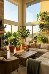
7. Design Around a Single Focal Point

Every room needs a “boss.” In teacher terms, we call this the focal point. It is the one thing that grabs your attention the second you walk through the door. If a room doesn’t have a focal point, it feels confusing. Your eyes just kind of wander around, looking for a place to land, and it makes the space feel unsettled.
I learned this when I helped my brother with his living room. He had nice furniture, but he just threw it in a circle. It felt like a dentist’s waiting room. I asked him, “What are we supposed to be looking at?” He didn’t have an answer. That was the problem.
Identifying the Star of the Show
Usually, the house decides the focal point for you. If you have a fireplace, that’s it. That’s the winner. If you have a huge window with a view of the garden, that’s the winner.
Once you know what the star is, you have to respect it. All your major furniture should basically be bowing down to it. Orient your sofa so it faces that point. If you have chairs, angle them so they are looking at it too. It creates a natural anchor. It tells people, “Sit here and look at this.” It makes the room feel organized because there is a clear purpose.
The Battle: TV vs. Fireplace
This is the biggest headache I see in modern homes. You have a beautiful fireplace on one wall, but you want to watch the football game on the other wall. So you have two focal points fighting for attention. It splits the room in half.
I struggled with this for years. I tried to put the TV in the corner, but it felt awkward. Honestly? The best solution is to combine them. I know some designers hate it, but putting the TV above the fireplace (if it isn’t too high) or on a low console right next to the fireplace is the way to go. You want to group them so you aren’t twisting your neck back and forth. You need to make a choice: is this a room for chatting by the fire, or is it a room for watching movies? Pick one primary function and arrange the furniture for that.
What If You Don’t Have One?
If you live in a plain boxy apartment with no fireplace and a view of a brick wall, you have to fake it. You have to create your own focal point.
In my bedroom, I didn’t have any architectural details. It was just four white walls. So, I bought a really big, colorful piece of art and hung it over the bed. That became the focal point. In the living room, a large media cabinet or a gallery wall can do the same thing. You just need one big visual element to anchor the space so the rest of the furniture has something to relate to. It gives the room a center of gravity.
Conclusion
Rearranging your home isn’t really about moving heavy stuff around; it is about changing how you live in your space. I used to think I needed a bigger house to be happy. But after messing around with these layouts, I realized I just needed to use the space I had better.
Whether you try the floating layout to stop the “waiting room” vibe or you simply clear a walkway so you stop bruising your shins, these changes make a huge difference. You don’t have to do all 7 ideas at once. That would be a chaotic weekend. Just pick one. Maybe try the diagonal bed trick or swap your sofa around.
Give it a try this Saturday. Grab a friend to help you lift the heavy stuff (pizza usually helps convince them). You might be surprised by how much bigger your room feels when the flow is finally right.
Pin this for later! (Seriously, save these layouts to your “Home Reno” board on Pinterest so you don’t lose them when you’re ready to start moving furniture!)