Have you ever walked into a room and felt… nothing? Just four walls, a ceiling, and a distinct lack of soul? We’ve all been there. It’s the feeling of a space that functions, sure, but doesn’t live. In 2026, that’s changing. We are moving away from the stark, clinical “showroom” look and diving headfirst into homes that hug you back!
I remember staring at my own living room last year, realizing it looked more like a dentist’s waiting area than a place I actually wanted to drink coffee in. That was my wake-up call. This year, the trends are all about “curated maximalism,” deep emotional connection, and sustainability that feels luxurious rather than crunchy. Whether you are renovating a fixer-upper or just swapping out throw pillows, these 7 room inspiration ideas will give you the roadmap to create a home that feels undeniably yours.
We’re talking about “cocoon” bedrooms that block out the noise of the world and kitchens designed for “social joy”. Ready to ditch the boring and embrace the bold? Let’s dive in.

1. The “Cocoon” Bedroom: Your Ultimate Sanctuary

We all have those days where the world just feels too loud. You come home, and you just want to shut everything out. That is exactly why the “Cocoon” bedroom is becoming such a massive hit for 2026. It isn’t just a place to sleep; it’s a spot to hide away and recharge your battery. Think of it less like a showroom and more like a bear’s den—but, you know, much cleaner and smelling better.
I started tweaking my own bedroom to feel more like this last winter, and I sleep way better now. It’s all about creating a space that feels safe, soft, and quiet. You don’t need to spend a fortune to get this vibe, either. It’s mostly about changing how the room feels to the touch and how it sounds.
Softening the Hard Edges
The first thing you have to deal with is the walls. Most bedrooms are just drywall and paint, which bounces sound around. That echo makes a room feel cold. The cocoon trend fixes this by putting fabric on the walls. You don’t have to hire a construction crew. You can hang heavy velvet curtains along a wall, even if there is no window there. It instantly dampens the noise from the rest of the house. If that is too much, try an oversized upholstered headboard. Get one that is wider than your bed. It visually “holds” the bed and stops sound from bouncing right next to your ears while you read or scroll on your phone.
Layering Your Bedding
Your bed needs to look like a cloud you can fall into. The mistake a lot of people make is buying a matching set in a bag and calling it done. That usually looks a bit flat. To get that cozy look, you need to mix your materials. Start with some soft, washed linen sheets. They breathe well and don’t feel slippery. Then, add a heavy duvet. At the foot of the bed, throw on a blanket with a totally different texture, like a chunky wool knit or faux fur. The mix of rough, smooth, and fluffy textures is what makes you want to reach out and touch it. It signals to your brain that it is time to relax.
Lighting That Hugs You
If you have a big “boob light” in the center of your ceiling, please do not use it. That harsh light wakes your brain up. For a sanctuary feel, you want light that sits low in the room. I use warm-colored bulbs (look for “warm white” or “amber” on the box) in lamps on the nightstands. Another great trick is putting a strip of LED lights behind your headboard or under the bed frame. It gives the room a soft, moody glow, almost like a sunset. It helps your eyes adjust and get ready for sleep without leaving you in total darkness.
Keep the Colors Earthy
Finally, look at your colors. Bright white can feel a little too clinical for a cocoon. You want colors that feel like they come from nature. I really love sage greens, terracotta oranges, or warm browns. These colors make the room feel smaller in a good way—intimate and grounded. Painting the ceiling the same color as the walls can also help wrap the room around you.
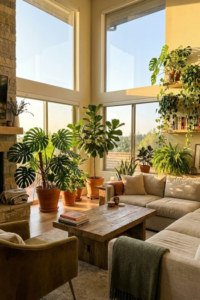
2. Biophilic Living Rooms: “Nature-Mimicking” Textures

We have all heard the advice to “bring the outdoors in,” right? Usually, that just means someone telling you to buy a fern or two and put them on a shelf. But for 2026, this idea is getting a lot deeper. It is not just about seeing green leaves; it is about feeling nature in the materials we use. We spend so much time staring at flat, glowing screens that our hands and eyes are craving something real and rough.
I noticed this in my own house when I realized everything felt too smooth. The table was laminated, the floor was slick, and the walls were flat paint. It felt a bit like a hospital waiting room. Biophilic design fixes that by bringing in “nature-mimicking” textures that ground you. It makes your living room feel like a living thing, not a plastic box.
Embracing the “Perfectly Imperfect”
The biggest change here is moving away from shiny, perfect surfaces. In nature, nothing is perfectly polished. So, in your living room, look for materials that show their age or how they were made. I swapped out my shiny coffee table for a raw wood one that has knots and a rough edge. It adds so much character. You want to look for things like unlacquered brass that changes color over time, or stone that feels bumpy under your fingers. These “honest” materials make a space feel warm. It is okay if there is a scratch on the wood or a dent in the metal. That just shows life is happening there.
Going Big with Greenery
If you are going to do plants, 2026 is the year to stop playing it safe. Forget the tiny succulents lined up on a windowsill. We are looking for architectural statements. Think about getting one massive indoor tree, like an olive tree or a large ficus. Treat it like a piece of furniture. It takes up space, sure, but it changes the whole air of the room. I put a large plant in the corner of my living room, and it instantly softened the acoustics and made the ceiling feel higher. If you can’t keep a tree alive (I have struggled with that too), a living moss wall art piece is a great alternative. It adds that soft, green texture without needing daily watering.
Ditching the Sharp Corners
Have you ever noticed that nature rarely has straight lines? Rivers curve, tree trunks twist, and hills roll. Our furniture, however, is usually full of sharp angles. To really get this look, try to find pieces that mimic organic shapes. A sofa with a curved back or a round rug can break up all the boxes in your room. It feels gentler on the eyes. When I replaced my square side table with a round, stump-like stool, the flow of the room just felt easier. It removes the rigidity and makes the space feel more like a landscape you can relax in.
3. The “Jewel Box” Powder Room: Color Drenching

Most of us treat the powder room—that tiny half-bath usually near the entryway—as an afterthought. It gets a coat of “safe” white paint, a standard mirror, and that’s it. But because this room is so small, it is actually the best place in the house to take a massive risk. In 2026, the trend is turning these small spaces into “Jewel Boxes” using a technique called color drenching.
I used to think that painting a small room a dark color would make it feel like a cave. I was totally wrong. When I finally got the courage to paint my downstairs bath a deep, moody blue, it actually made the walls recede. It feels like stepping into a little magic trick.
Commit to the Color
The secret to this look is “Color Drenching.” This means you don’t just paint the walls. You paint everything. I’m talking about the baseboards, the crown molding, the back of the door, and yes, even the ceiling. You use the same color for all of it. When you leave the trim white, it creates a boxy outline that reminds your eye exactly how small the room is. But when you paint the ceiling and trim the same deep color (like a dark aubergine, a burnt spice, or a forest green), those hard lines disappear. The corners get blurry. It creates this infinite, immersive feeling that is really cool. It feels more like being inside a cozy velvet box than a cramped bathroom.
Add the “Jewelry”
Since the walls are dark and dramatic, you need some sparkle to make it pop. This is why we call it a “Jewel Box.” Think of your faucet, the towel ring, and the mirror frame as the jewelry. Against a dark background, you want metals that shine. Unlacquered brass or polished gold looks amazing against deep colors. It catches the light and adds a bit of luxury. If you have a plain builder-grade mirror, try swapping it for something vintage with a gold frame. It doesn’t have to be expensive; I found a great one at a thrift store that totally changed the look of my room.
Lighting Makes the Mood
Please, for the love of good design, do not use bright “daylight” bulbs in a room like this. It will ruin the vibe. You want this space to feel moody and atmospheric. Since the walls are dark, they will absorb a lot of light, so you might think you need brighter bulbs. But the goal isn’t to make it bright enough to perform surgery; it’s to make it pleasant for a quick visit. Use lower wattage, warm bulbs. If you can, add a small lamp on a shelf or wall sconces that cast a glow down the wall. It makes the paint color look rich and hides any imperfections in the drywall. It turns a boring trip to the bathroom into a little “wow” moment for your guests.
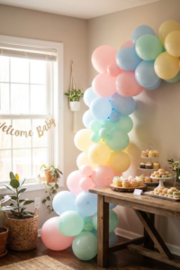
4. The Social Kitchen: The “Joy-First” Hub

You know how it goes. You spend days cleaning the living room and fluffing the pillows for a party, but where does everyone actually end up? Standing around the kitchen island. Every single time. In 2026, we are finally just accepting this fact. The kitchen isn’t just a place to boil water anymore; it is the “Joy-First” hub of the house.
I remember my old kitchen was all stark white and shiny surfaces. It looked clean, sure, but it felt like a science lab. Nobody wanted to hang out in there. The new trend is about making the kitchen feel as warm and inviting as your living room. It’s about prioritizing the people sitting there over the efficiency of the cooking triangle.
The Double Island Strategy
If you have the square footage, the biggest flex right now is the double island. I know, it sounds like a lot. But here is why it works: you keep the mess on one and the people on the other. One island is for your cutting boards, the sink, and the messy prep work. The second island is strictly for socializing. It’s usually a bit higher or has nicer materials, and you put comfortable stools around it. If you don’t have space for two massive islands (I definitely don’t), just rethink your current one. Extend the countertop so people can sit comfortably without banging their knees. The goal is to make sure your guests can face each other, not just stare at your back while you cook.
Ditching the “Sterile White” Look
For a long time, the “perfect” kitchen was all white cabinets and white marble. That is pretty much gone now. We are seeing a huge return to warm woods. I’m talking about walnut, oak, or timber that actually looks like wood. It brings instant warmth to the room. When I swapped my cabinet fronts for a warm oak finish, the whole room felt different. It stopped feeling cold. You can mix this with warmer paint colors too. Instead of bright white walls, try a creamy off-white or even a soft beige. It makes the space feel lived-in and cozy, rather than a showroom you are afraid to touch.
“Curated” Clutter
Open shelving used to be scary because you had to keep it perfect. But the “Joy-First” kitchen embraces a little bit of chaos, as long as it is the pretty kind. We call this displaying your “curated maximalism.” Hide the ugly plastic tupperware and the blender behind solid doors. But take your nice ceramic bowls, the colorful mugs you bought on vacation, or your favorite cookbooks, and put them on display. Glass-front cabinets are great for this if you hate dusting. It adds personality. It tells a story about who lives there. A kitchen with nothing on the counters looks like nobody lives there. A kitchen with a bowl of lemons and a stack of mismatched plates looks like a home.
5. The “Fifth Wall” Focus: Ceiling Treatments

When we paint a room, we usually look at the four walls around us and totally forget the one right above our heads. For years, I just bought that big bucket of standard “ceiling white” and rolled it on without thinking. But in 2026, designers are calling the ceiling the “Fifth Wall,” and honestly, it is about time it got some love.
Treating the ceiling like a blank canvas changes the whole feeling of a room. It stops the space from feeling like a generic drywall box. I recently tried this in my dining room, and it was the missing piece I didn’t know I needed. It pulls your eye upward and makes the room feel “finished” in a way that just painting the walls never does.
Wallpaper Overhead
I know what you are thinking—hanging wallpaper is hard enough on a wall, let alone on the ceiling. And yeah, your neck might get a little sore doing it. But the payoff is huge. Putting a bold pattern on the ceiling is a great trick for rooms that feel a bit plain. If you have a room with simple furniture and neutral walls, a floral or geometric wallpaper up top adds a surprise element. It’s like a hidden gem. I’ve seen this work really well in bedrooms. You lie in bed, look up, and instead of a boring white expanse, you see something beautiful. It actually distracts from any weird lumps or bumps in the plaster, too.
Faking the Farmhouse Look with Beams
We aren’t all lucky enough to live in a 100-year-old cottage with original timber beams. My house is pretty standard construction, so it lacks that architectural “bones” look. But you can fake it. Adding faux wood beams to a ceiling is a massive trend right now. They make lightweight hollow beams that look just like heavy, old wood. You can glue or screw them right into the ceiling. It instantly gives a room that rustic, warm character. It breaks up the flat surface and adds shadows and depth. It makes a new house feel like it has some history.
Painting it Darker
If wallpaper or beams sound like too much work, just grab a paint can. But don’t grab the white one. Painting the ceiling a color that contrasts with your walls creates a really cozy vibe. For a long time, people told me that painting a ceiling dark would make the room feel small and claustrophobic. That isn’t always true. If you have high ceilings, painting them a darker shade (like a charcoal or a deep blue) can visually bring the ceiling down a bit, making the room feel more intimate and grounded. It’s perfect for a media room or a den where you want to feel tucked in. Even a soft grey or beige up there is softer on the eyes than stark white.
6. Curated Maximalism: The Anti-Catalog Living Room

For the longest time, I thought being “good” at decorating meant flipping open a furniture catalog and buying everything on page 42. The matching sofa, the matching loveseat, the matching rug. It was easy, sure. But after a while, I realized my living room looked exactly like my neighbor’s. It had zero personality. In 2026, we are throwing that rulebook out. We are embracing “Curated Maximalism,” which is basically a fancy way of saying: fill your house with stuff you actually love, even if it doesn’t “match.”
This isn’t about hoarding or having a messy house. It is about taking your time to find pieces that mean something to you. It is the anti-catalog look. It says, “A real person lives here, not a mannequin.”
Mixing the Old with the New
The quickest way to kill the vibe in a room is to have everything be brand new. It feels flat. To get that curated look, you have to mix eras. I love the look of a sleek, modern sofa—it’s comfortable and clean. But if you put a shiny modern coffee table next to it, it’s too much. Instead, try pairing that modern sofa with a battered antique wooden chest. Or put a weird, funky lamp you found at a flea market on a brand new side table. The contrast creates energy. It makes people look twice. It stops your home from feeling like a showroom where you can’t touch anything.
Telling Your Own Story
Your shelves shouldn’t just be filled with generic filler balls and fake books from the decor store. That stuff is soulless. Curated maximalism is about putting your life on display. I have a weird ceramic dog I bought on a road trip ten years ago. It’s not “stylish” in the traditional sense, but it makes me smile. That goes right on the mantle. Frame the ticket stubs from a concert you loved. Put out the ugly vase your aunt gave you if it reminds you of her. When someone walks into your room, they should learn something about you just by looking around. If your decor doesn’t tell a story, it’s just clutter.
Don’t Be Scared of Patterns
A lot of us get nervous about mixing patterns. We think, “If I have stripes here, I have to have solid colors everywhere else.” Nope. Maximalism gives you permission to break that rule. You can put a floral pillow on a plaid chair. You can have a Persian rug with a geometric blanket. The trick is to keep the colors somewhat related. If there is a bit of blue in the rug, make sure there is a bit of blue in the pillow. As long as there is one connecting thread, you can go wild. It makes the room feel rich and layered, like a cozy blanket you pulled together over years.
7. The Tech-Integrated Home Office: Hidden Smarts

A few years ago, we all scrambled to shove desks into corners and called it a “home office.” Let’s be honest, for most of us, it looked like a disaster zone. I remember tripping over extension cords every time I walked into the guest room. It felt more like a call center than part of my home. In 2026, the home office is strictly a permanent fixture, but the vibe has totally shifted. We are moving towards “Tech-Integrated” spaces where the smart stuff is hidden, and the room feels like a cozy library.
The goal here is pretty simple: you want a space that functions like a high-powered workspace but disappears when you log off at 5 PM. It shouldn’t stress you out just looking at it on a Saturday.
Making the Screens Disappear
The biggest eyesore in any office is the “black hole” of computer monitors. They are big, ugly, and plastic. The new trend is all about camouflage. I finally invested in one of those smart monitors that displays art when it’s asleep. It makes such a difference. instead of a dark rectangle, I have a landscape painting on my wall. If you can’t get a new monitor, focus on the wires. “Hidden smarts” means you shouldn’t see how the magic happens. I drilled a hole in the back of my desk drawer to stash my power strip. Now, I have one single cord running to the wall. It’s a small fix, but it stops the room from looking like a tech explosion.
Soundproofing That Doesn’t Look Ugly
We have all been on those video calls where someone sounds like they are shouting from inside a bathroom. The echo is terrible. But please, do not glue those jagged grey foam squares to your wall. They look like packing material. The fix for 2026 is “acoustic art.” Companies are making sound-absorbing panels that look exactly like canvas prints or fabric wall hangings. I hung a large fabric panel behind my desk. It stops the echo, but to anyone visiting, it just looks like a piece of abstract art. It makes the room feel softer and quieter, which helps me focus even when I’m not on a call.
The “Library” Aesthetic
Finally, stop trying to make your home office look like a corporate cubicle. You don’t need a metal filing cabinet or a plastic chair mat. The trend now is to lean into a “library” feel. I swapped out my utilitarian metal shelves for a wall of wooden bookcases. I filled them with books, a few plants, and some photos. It instantly warmed up the space. It feels like a gentleman’s study from an old movie, not a workspace. When you surround yourself with things that feel residential—like a nice rug or a wooden desk lamp instead of a plastic one—it makes working from home feel less like a chore and more like a comfortable part of your day.
Conclusion
Building a home that feels like “you” takes time. It isn’t a race to the finish line. We looked at a lot of different ideas today, from the dark and cozy “Jewel Box” powder rooms to those big, welcoming kitchens built for hanging out. It can feel like a huge job to update your space, especially when you see those perfect pictures online. I get it. When I look at my own to-do list for the house, it sometimes feels miles long.
But here is the thing I have learned over the years: you don’t have to do it all at once. In fact, you shouldn’t. The best homes—the ones that feel warm and real—are the ones that evolve slowly. Maybe this year you just focus on fixing the lighting in your bedroom to make it a better place to sleep. Or maybe you just buy one really cool, weird vintage lamp for the living room to start your “curated” collection. That is enough.
The goal of these 2026 trends isn’t to make your house look like a trendy catalog page. The goal is to make your home serve you better. We want spaces that hug us when we are tired, kitchens that make it easier to laugh with friends, and offices that don’t give us a headache. If you stick to the changes that actually make you feel good, you can’t really go wrong.
So, take a deep breath. Look around your room. Pick one small thing that bugs you, and fix that first. Your home is your story, so take your time writing it.
Save These Ideas for Later If these ideas sparked a little lightbulb in your head, don’t let them float away! You might not be ready to paint your ceiling today, and that is fine. Go ahead and pin this article to your “2026 Dream Home” board on Pinterest so you can find it exactly when you are ready to pick up a paintbrush. Happy decorating!