I still remember standing in my living room last Tuesday, coffee in hand, staring at a beige wall that felt like it was draining the energy right out of me! Have you ever felt that? That sudden realization that your home feels less like a sanctuary and more like a… waiting room? You aren’t alone. In fact, a recent interior design report highlighted that over 60% of homeowners are prioritizing “emotional grounding” in their renovations for 2026.
We are moving away from the stark, cold minimalism of the past few years. 2026 is all about warmth, personality, and spaces that actually hug you back! I’ve spent the last month diving deep into the latest trends—sifting through color forecasts and architectural digests—to bring you ideas that are not just trendy, but livable. Whether you want to embrace the biophilic design craze or finally try color drenching, these ideas will help you create a home that feels uniquely yours.
Let’s dive in!

1. The “Cocoon” Bedroom

We spend about a third of our lives sleeping, right? So why do we treat our bedrooms like just another room to store laundry in? I honestly used to be guilty of this. My bedroom was just a place to crash after a long day at school. But lately, I’ve realized that with everything going on outside, we need a place that feels safe inside. That’s exactly what the “Cocoon” trend is about. It is basically turning your room into a giant bear hug. It’s not about showing off for guests—cause who goes in there anyway?—it’s about how you feel when you close the door. It is moving away from those sharp, cold designs we saw years ago and finding comfort in the dark and fuzzy.
Layering Is Your Best Friend
You can’t create a cozy vibe with just a flat sheet and a thin blanket. It just doesn’t work. To get that cocoon feeling, you have to pile it on. I’m talking about mixing materials that feel different against your skin. Start with a padded headboard if you can. I bought a velvet one last year, and it stops the room from echoing, making it quiet and still. Then, throw on a chunky knit blanket or some washed linen at the foot of the bed. It’s okay if it looks a bit messy; that actually helps it feel more inviting, like a bed you want to jump into, not one you’re scared to wrinkle. The goal is to make the bed look soft enough that you could sink right through it.
Ditch the Bright Whites
For years, everyone told me to paint walls white to make the room look bigger. But for a cocoon room? You want the opposite. You want it to feel intimate and enclosed. We are seeing a lot of deep, moody colors this year. Think about the color of your morning coffee—rich mochas, warm cappuccinos, or even a deep burgundy. These dark colors absorb light instead of bouncing it around, which tells your brain it’s time to wind down. If painting the whole room feels too scary, just try the wall behind your bed first. It changes the whole vibe without needing a ton of paint.
Lighting That Calms You Down
Here is a rule I try to live by: never use the “big light” after 8 PM. Overhead lighting is too harsh for a sanctuary. Instead, you want pockets of warm light. I swapped my bedside bulbs for warm amber ones, and it made such a difference. You can also try hidden LED strips under the bed frame or behind the headboard. It gives this soft glow that isn’t bright enough to wake you up but helps you see where you’re going. It creates a mood that instantly drops your shoulders a few inches. You want the light to feel like a sunset, not a grocery store.
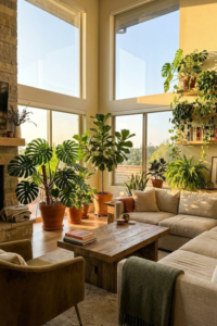
2. Biomorphic Living Rooms

I used to have this big, square glass coffee table in the middle of my living room. It looked nice in photos, but my shins had a different opinion. I can’t tell you how many times I walked by and banged my leg on a sharp corner. It hurt! But beyond the bruises, I realized that all those straight lines and sharp edges made my living room feel kind of strict. It felt like a place you had to sit up straight in, not a place to flop down and relax. That is why I am so happy about the shift to biomorphic design in 2026. It sounds like a fancy science word, but “biomorphic” just means shapes that look like nature. Think of river rocks, leaves, or the curve of a mushroom.
No More Sharp Corners
The biggest change here is getting rid of the boxy look. For a long time, modern design was all about grids and perfect rectangles. But nature doesn’t really do straight lines. Trees aren’t perfectly straight, and neither are rivers. When you bring those curvy, organic shapes into your home, it tricks your brain into relaxing. It feels safer. I swapped that dangerous square table for a wooden one shaped like a pebble, and the whole room instantly felt softer. It’s not just about safety, though that’s a huge plus if you have kids or clumsy pets; it’s about creating a flow that feels easy to move through. You don’t have to walk in robot-like 90-degree turns anymore.
The “Croissant” Sofa Phenomenon
You have probably seen these all over social media already. We call them “croissant” sofas because they literally look like the pastry—curved, puffy, and comforting. I sat on one at a furniture store last month, and it completely changed how I thought about seating. A straight couch pushes everyone to face forward, like you are waiting for a bus or watching TV. But a curved sofa? It angles people toward each other. It naturally encourages you to talk and look at your family or friends. If buying a whole new couch isn’t in the budget right now, you can start small. Try adding a round rug or a couple of spherical pillows. Even a curvy mirror on the wall can break up the boxiness of a standard room.
Let the Traffic Flow Naturally
One mistake I see a lot is people pushing all their furniture right up against the walls. It leaves this big, empty dance floor in the middle that nobody uses. With biomorphic design, you want to pull things in. Think of creating little islands or circles. Because the furniture has rounded backs and sides, it looks good from every angle, so you don’t need to hide the back of the sofa against a wall. This lets you create pathways—or “traffic flow”—that meander through the room like a trail in the woods. It makes the room feel less like a showroom and more like a living, breathing space where you can actually live.
3. The “Fifth Wall” Makeover

I remember painting my dining room this beautiful deep green a few years ago. I spent all Saturday taping off the trim, sweating in my old painting clothes. But when I finally peeled the tape off, I was disappointed. That stark, bright white ceiling just… glared at me. It looked like a cheap lid on a nice shoebox. That is when I learned that interior designers call the ceiling the “fifth wall.” For the longest time, most of us just defaulted to “ceiling white” because it was safe and easy. But in 2026, leaving your ceiling blank is kind of like wearing a tuxedo with flip-flops. It just feels undone. We are finally giving the ceiling the attention it deserves, and it changes the whole feeling of a room.
Paint It All One Color
The easiest way to try this—and the one I recommend starting with—is something called “color drenching.” This is just a fancy way of saying you paint the ceiling the exact same color as your walls. I know what you are thinking because I thought it too: “Won’t that make the room feel tiny?” remarkably, it usually does the opposite. When you have a white ceiling and colored walls, your eye goes right to that sharp line where they meet. It defines the box. But when you paint it all the same color, those lines disappear. The corners blur out, and the room actually feels endless. It creates this immersive, moody vibe that is perfect for living rooms or TV rooms. Plus, you don’t have to worry about cutting in a perfect straight line at the top of the wall!
Pattern Isn’t Just for Walls
If you are feeling a bit braver, look up. Wallpaper on the ceiling is becoming huge. I visited a friend recently who had a small powder room—tiny place, really nothing special. But she had put this bold, floral wallpaper on the ceiling. It was such a fun surprise. Every time you walked in, you couldn’t help but look up and smile. It draws the eye upward, which makes low ceilings feel a bit higher because you are focused on the design, not the height. It works really well in rooms where you spend a lot of time sitting down or lying down, like a bedroom or a dining room, because you actually have the time to look at it.
Adding Some fake History
Not all of us live in charming old farmhouses with original beams. My house was built in the 90s, and it’s basically a drywall box. A great way to fix that “cookie-cutter” look is to add architectural details to the fifth wall. You can buy lightweight faux wood beams that look just like the real thing but are easy to glue or screw up there. It adds instant warmth and texture. Or, if you want something fancier, adding crown molding or a ceiling medallion around your light fixture acts like jewelry for the room. It stops the ceiling from looking like a big, flat wasteland and gives it some character.
4. Japandi Maximalism

I have always had a bit of a love-hate relationship with minimalism. On one hand, I love how clean and peaceful a clutter-free room looks in a magazine. But on the other hand? I have stuff! I have books I love, souvenirs from family trips, and a collection of weird ceramic mugs that I just can’t part with. For a long time, I felt like I had to hide all these things away in closets to make my house look “designed.” That is why I am so relieved that Japandi Maximalism is taking over in 2026. It sounds like a contradiction, doesn’t it? Japandi is usually all about Japanese rusticity mixed with Scandinavian simplicity—very sparse. But this new twist lets us keep the calm vibes while actually displaying the things that make us happy.
It’s Not Hoarding, It’s Curating
The key here is that we aren’t just dumping everything we own onto a shelf. That would just be a mess. Instead, it is about “curated clutter.” I used to keep my bookshelves totally empty except for maybe three artistic vases. It felt soulless. Now, I fill them up, but I do it carefully. You want to group things together. Put your handmade pottery on one shelf and stack your favorite hardcovers on another. It is about giving your eyes something interesting to look at without overwhelming them. Think of your shelves as a museum display for your life. If you love it, show it off! It adds personality that a bare wall just can’t give you.
Warming Up the Colors
Traditional Japandi was very gray, white, and light wood. It was pretty, but sometimes it felt a little cold, like you couldn’t touch anything. This maximalist version is much warmer. We are swapping those cool grays for colors that feel like a hug—oatmeal, terracotta, and warm walnut woods. I painted my hallway a soft beige recently instead of the stark white it used to be, and it instantly made the space feel more welcoming. You want a background that feels earthy so that when you add your layers of “stuff,” it feels cozy rather than chaotic.
Embracing the Imperfect
There is a Japanese concept called wabi-sabi, which is basically finding beauty in things that aren’t perfect. This is a huge part of this trend. Stop worrying if your table has a scratch or if your ceramic bowl is a little lopsided. That is what makes them special. I used to stress out about keeping everything looking brand new. Now, I look for furniture that already looks a bit worn in. A vintage rug with faded colors or a wooden chair that shows its grain looks so much better than shiny, mass-produced plastic. It tells a story. It says that people actually live here and enjoy the space.
5. The “Raw Earth” Kitchen

I used to dream about having one of those gleaming, all-white kitchens. You know the ones—they look like a spaceship, totally spotless and shiny. But then I actually visited a friend who had one, and I realized something: they are a nightmare to keep clean! Every fingerprint shows up. If you have kids or a dog, or just cook with oil, that shiny perfection gets ruined in five minutes. That is why I am so relieved that the “Raw Earth” trend is taking over in 2026. This style is all about “honest” materials. We are saying goodbye to plastic-feeling surfaces and high-gloss finishes. Instead, we want kitchens that feel tactile, grounded, and a little bit rugged. It’s about materials that look better as they get older, not worse.
Walls You Want to Touch
For the longest time, I just used standard latex paint in my kitchen. It was fine, it wiped down easy. But it looked a bit flat. The big shift now is toward textured paints, specifically limewash. I tried this in my pantry recently, and it is amazing. Limewash dries with this chalky, velvety texture that has natural highs and lows in the color. It gives the walls depth that you just can’t get from a regular can of paint. It feels old-world and cozy, like you are in a farmhouse in Italy rather than a subdivision. Plus, because it’s textured, it hides dings and scratches way better than flat paint does.
Wood That Actually Looks Like Wood
We are also seeing a huge move away from painted cabinets. For years, everyone painted their cabinets gray or navy. Now, we want to see the grain. But I’m not talking about that orange oak from the 90s (nobody wants that back!). I mean raw, matte woods like white oak or walnut. The goal is to keep the finish looking natural, not sealed under a thick layer of shiny varnish. It brings warmth into the room that painted cabinets just can’t match. It makes the kitchen feel less like a sterile lab and more like a room where you actually hang out and eat comfort food.
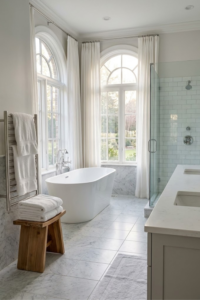
Stone Without the Glare
If you are looking at countertops, skip the polished granite. That high-gloss look that reflects the overhead lights is fading out. In 2026, it is all about “honed” or “leathered” finishes. I learned about leathered stone recently—it has this slight texture to it, almost like an orange peel, and it is matte. Soapstone is another great option. It feels soft and powdery to the touch, not cold and hard like polished stone. These surfaces don’t glare at you. They absorb the light, which makes the whole kitchen feel softer and calmer on your eyes, especially early in the morning before you’ve had your coffee.
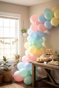
6. The “Jewel Box” Powder Room

I have a confession to make. I am usually terrified of dark paint. I always worry it will make my house look like a cave. But there is one exception to this rule, and that is the powder room. Because it is such a small space where you don’t spend a ton of time, it is the perfect place to take a risk that you would never take in your living room. In 2026, we are calling this the “Jewel Box” trend. The idea is to treat this tiny bathroom like the inside of a jewelry box—rich, shiny, and a little bit dramatic. It’s meant to be a surprise for your guests. They leave the bright hallway, open the door, and wow, they are in a totally different world.
Go Dark or Go Home
If you have a small bathroom, your instinct might be to paint it white to “make it look bigger.” Trust me, that doesn’t really work. A small white room just looks like a small white room. Instead, lean into the smallness. We are seeing deep, saturated colors taking over. I’m talking about emerald greens, sapphire blues, or my personal favorite for this year, aubergine (which is a fancy word for eggplant purple). When you wrap the room in these dark colors—painting the walls and even the trim—it blurs the corners. You stop seeing where the room ends. It feels cozy and expensive rather than just cramped.
Make Everything Shine
Since you are using dark colors, you need to bring in some light so it doesn’t feel like a dungeon. But I don’t mean adding more light bulbs. I mean using surfaces that reflect light. High-gloss paint is a game changer here. If you paint the walls or the ceiling in a lacquer finish, it acts almost like a mirror. It bounces the light around and makes the space feel vibrant. It’s a bit more work to paint because you have to sand the walls smooth first, but the result is worth it. It looks wet and glossy, just like a gemstone. You can also swap out a plain wooden vanity for one with a heavy marble top. The veining in the stone adds pattern without you having to buy art for the walls.
Jewelry for Your Room
Think of your faucet and towel rings as the jewelry of the room. In a “Jewel Box” bathroom, you don’t want boring chrome. It just looks too cold against those warm, dark walls. I swapped my hardware for unlacquered brass, and it warmed the whole place up. The best part about unlacquered brass is that it changes over time—it gets a patina that looks vintage and lived-in. It feels like something you would find in an old hotel. Combine that with some moody lighting, like a pair of sconces with fabric shades instead of a bright overhead light, and you have a space that feels special. It’s a small project, but it packs a huge punch.
7. The Tech-Invisible Home Office

I’ll be honest, I love my gadgets. I rely on my laptop, my tablet, and my printer every single day. But do I want to look at a tangled mess of black cords and blinking lights when I’m trying to relax? Absolutely not. For the longest time, my home office looked more like the back room of an electronics store than a part of my house. I had power strips on the floor collecting dust bunnies and cables snake-ing across my desk. It was stressful just looking at it. That is why the “Tech-Invisible” trend for 2026 is such a breath of fresh air. It is all about having the technology we need but hiding it so the room feels calm and studious, not cluttered.
Wireless Is the Way to Go
The best thing I ever bought for my desk was a wireless charging pad. But now, furniture makers are taking it a step further. You can actually get desks where the charger is built right into the wood or stone top. You just set your phone down on the corner of the desk, and it charges. No cables, no plugs, no mess. It feels like magic. If you aren’t ready to buy a new desk, you can drill a hole in your current one and mount a charger underneath. It keeps the surface completely clean. I also switched to a wireless mouse and keyboard. It sounds like a small change, but getting rid of those two wires made my whole workspace feel twice as big.
Hiding the “Ugly” Boxes
Let’s face it: printers, routers, and modems are ugly. They just are. They are big, plastic boxes that never match anything. The big shift this year is designing storage specifically to hide these things. I cleared out a bottom cupboard in my bookshelf and drilled a hole in the back for the cords. Now, my printer lives in there. When I need to print, I just open the door. The rest of the time, it’s out of sight. You can do the same with your Wi-Fi router—just make sure the cupboard has some airflow so it doesn’t overheat. The goal is to make your office look like a library or a study, where the focus is on books and wood, not blinking green lights.
Smarter Lighting That Looks Dumb
I mean “dumb” in a good way! We are moving away from those high-tech looking desk lamps that look like robots. Instead, we are using smart bulbs inside traditional lamps. I have a brass reading lamp that looks like it is from the 1920s, but inside it has a smart bulb that changes color temperature throughout the day. In the morning, it is bright and cool to help me wake up. By the afternoon, it shifts to a warmer, golden light that is easier on my eyes. It helps me sleep better at night, and the lamp itself just looks like a nice piece of decor. You get all the benefits of the tech without having to stare at a piece of plastic.
Conclusion
Changing your home is a big deal. I know it can feel like a lot of work. When I first looked at all these new ideas for 2026, I felt a little overwhelmed myself. But remember, you don’t have to do everything at once. You don’t need to rip out your kitchen cabinets tomorrow or paint every ceiling in your house this weekend. That is the quickest way to burn out. I’ve been there, staring at half-painted walls wondering why I started.
The best thing to do is just pick one thing that spoke to you. Maybe it was the “Cocoon” bedroom because you are tired of not sleeping well. Or maybe it was just buying a new, curvy coffee table to save your shins. Home design isn’t really about following rules or impressing the neighbors. It is about creating a place where you can just be yourself. We spend so much time running around, working, and taking care of everyone else. Your home should be the one place where you don’t have to perform.
I hope these ideas gave you some inspiration to try something new. It’s funny how just changing a light bulb to a warmer color or moving a sofa can change your whole mood. If you try any of these, I would love to hear about it. But for now, take your time. Look at your rooms and ask yourself how they make you feel, not just how they look.
Did you find this helpful? If you did, please save this to your “Dream Home” or “2026 Ideas” board on Pinterest so you can find it later!