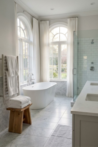
Did you know that in 2026, “beige” is no longer a dirty word in interior design? In fact, it’s making a massive comeback, but not the builder-grade beige you remember from the early 2000s. We are talking about rich “mushroom” tones, warm limestone, and sandy hues that feel like a hug! I’ve seen so many clients burnt out by the stark, sterile “all-white” farmhouse look. They want a sanctuary. They want a bathroom that feels like a boutique hotel in Tulum or a spa in Kyoto.
And let’s be real—renovating a bathroom is stressful! You pick a tile, and suddenly you’re spiraling about grout colors at 3 AM. (We’ve all been there!). But sticking to a neutral palette is the ultimate cheat code. It’s timeless, calming, and foolproof if you know how to layer it correctly. The secret isn’t just picking “white paint”; it’s about texture, warmth, and what we call “quiet luxury.”
In this article, I’m going to walk you through 7 specific ways to nail neutral bathroom decor in 2026. We’ll move beyond the basics and talk about microcement, organic lighting, and why your choice of hardware is basically the jewelry of the room. Let’s dive in!
 1")
1. Embrace “Tactile Minimalism” with Textured Walls
 2")
I have to be honest with you—I completely messed up my first bathroom renovation. I thought sticking to a “neutral palette” just meant painting everything a crisp, bright white and calling it a day. I remember standing in the finished room, looking at the flat, semi-gloss drywall, and feeling… absolutely nothing. Actually, that’s not true. I felt like I was standing in a sterile dental clinic. It was cold, boring, and frankly, it felt cheap. That is when I learned the hard way that when you take away color, you have to replace it with texture.
Why Flat Paint Kills the Vibe
Here is the thing about neutral bathrooms: without texture, they fall flat. Literally. Standard paint reflects light evenly, which highlights every single imperfection in your drywall (and trust me, there are always imperfections). In a neutral space, we want shadows. We want movement. We want the walls to look like they have a story. This is where “tactile minimalism” comes in. It is not about having less stuff; it is about having stuff that feels good to touch.
The Limewash Learning Curve
My favorite fix for this is limewash paint. It’s been around for centuries, but it’s blowing up in 2026 for a reason. I tried to DIY this last year in my powder room. I’m not gonna lie, the first coat looked like a patchy mess, and I panicked. But that is the trick with limewash—you have to trust the process.
You apply it with a block brush in chaotic X-patterns. When it dries, the minerals calcify on the surface, creating this cloudy, velvet-like depth that flat paint just can’t touch. It absorbs light rather than reflecting it, making the whole room feel softer and quieter. Plus, it is naturally resistant to mold, which is a huge bonus in a damp bathroom. Just make sure you use a sealer if it’s near the sink!
Stepping Up to Microcement
If you are ready to spend a bit more cash, look into microcement or Tadelakt. This stuff is next level. It’s a waterproof plaster that creates a seamless, stone-like finish. I saw this in a hotel in Mexico and couldn’t stop touching the walls (weird, I know). It eliminates grout lines entirely, which means less scrubbing for you later.
Quick tip from experience: Do not try to DIY microcement unless you are practically a pro. It sets fast and if you mess up the trowel movement, you are stuck with it.
Texture brings the “Warmth”
At the end of the day, textured walls ground the space. They make a beige bathroom feel like a hug rather than a hospital. Whether you go with a $60 can of limewash or a $2,000 plaster job, that uneven, organic surface is the secret sauce to “quiet luxury.” It makes the room feel finished in a way that artwork or towels just can’t fix.
2. Warm Wood Elements to Ground the Space
 3")
I used to think that to get a clean, modern look, you had to banish wood from the bathroom. I had this idea that wood was “rustic” or “farmhouse” (and I was so over shiplap). So, in one of my earlier projects, I went all tile and stone. Big mistake. The room echoed. It felt cold. It felt… unwelcoming. I realized pretty quickly that you need something organic to break up all those hard, shiny surfaces. That is where warm wood comes in. It is the anchor that stops your neutral room from floating away into boring territory.
Ditch the Grey, Go for Walnut
For the longest time, everything was “grey wash.” You know that driftwood look? It had its moment, but in 2026, we are really shifting away from that. It just looks a bit tired now. The goal now is warmth. We are talking rich walnuts, white oaks with a honey tone, or even teak.
When I swapped out a stark white cabinet for a walnut vanity in my guest bath, the whole vibe changed instantly. It didn’t look cluttered; it just looked grounded. The dark wood creates this beautiful contrast against a creamy beige wall. It acts as a focal point that feels expensive, even if you just bought the vanity at a big-box store.
Texture is Your Friend Here Too
Just like with the walls, flat wood panels can sometimes be a bit boring. I’m loving the reeded or slatted wood details we are seeing lately. It adds that architectural interest without being loud. I found a vanity with these vertical slats, and it hides fingerprints so much better than the flat slab doors I used to have. Plus, it gives the light something to catch onto.
If you can’t afford a whole new vanity (because, wow, they are pricey), try adding floating wood shelves. I put two chunky oak shelves above the toilet—classic spot, right?—and styled them with towels. It added that necessary warmth without a massive renovation bill.
The Water Warning (Read This!)
Okay, teacher mode for a second. Wood and water do not get along. I learned this the hard way when my kids splashed water all over a cheap particle-board cabinet, and the bottom edge swelled up like a sponge. It was ruined.
If you are buying wood furniture for the bathroom, look for solid wood or high-quality marine-grade plywood veneers. And please, make sure you wipe up standing water. It takes two seconds, but it saves your furniture. If you are too worried about the humidity, stick to wood accessories like a teak stool in the corner or a bamboo bath tray. They give you the organic look with basically zero risk.
3. “Quiet Luxury” Hardware: The Jewelry of the Room
 4")
I tell my friends this all the time: if your tiles are the outfit, your hardware is the jewelry. You wouldn’t wear a stunning evening gown and then slap on a plastic watch, right? But that is exactly what I see happening in so many bathrooms. People spend their whole budget on fancy stone or vanity cabinets, and then they grab the cheapest, shiny chrome faucet they can find. It honestly ruins the whole look.
The Problem with “Builder Chrome”
I used to be guilty of this. In my first house, I just left the standard silver taps because they worked fine. But they always looked cold, and worse, they showed every single water spot. Every time I brushed my teeth, I felt like I had to wipe the faucet down. It drove me crazy.
In 2026, we are moving away from that stark, mirror-like finish. We want warmth. This is why Brushed Nickel and “Warm Pewter” are taking over. They have this soft, satin glow that doesn’t scream for attention. They sit quietly in the room. Plus, they hide fingerprints and water spots way better than chrome, which is a lifesaver if you have kids (or a messy partner).
Champagne Bronze is Not 80s Brass
Now, let’s talk gold. I know, I know. You hear “brass faucet” and you think of your grandma’s house in 1985 with those shiny yellow fixtures. That is not what is happening now. The trend is “Champagne Bronze.” It is much softer, almost like a muted gold with a hint of brown in it. It looks expensive.
I swapped out my master bath hardware for champagne bronze last year, and it instantly warmed up the grey tiles I regretted choosing. It made the room feel cozy instead of sterile. Just be careful—every brand’s “gold” is different. Always buy your shower trim and sink faucet from the same brand so they match.
Texture You Can Feel
This is my favorite part. Have you seen those faucets with the diamond-cut patterns on the handles? That is called “knurling.” It’s a huge trend right now. It adds a little bit of grip, sure, but mostly it just feels heavy and solid.
When you grab a handle that has some texture and weight to it, your brain registers “quality.” It’s a small detail, but in a neutral bathroom where there isn’t a lot of color, these little textures matter a lot. It’s that “quiet luxury” thing everyone talks about—it doesn’t shout, but it feels nice.
Mixing Metals? Yes, You Can.
Finally, don’t be scared to mix things up. I used to think everything had to match perfectly. But actually, it looks more designed if you mix a little. I love seeing a matte black faucet paired with bronze light fixtures. It adds depth. Just don’t go crazy—stick to two finishes max, or it starts to look like a showroom sale bin.
4. Layered Organic Lighting
 5")
I have a confession. For years, I got ready every morning under one single, bright ceiling light. You know the kind—the flush mount fixture right in the center of the room. I hated it. It cast these harsh shadows under my eyes that made me look tired even after a full night of sleep. I just thought that was how bathrooms were supposed to be. It wasn’t until I visited a really nice hotel that I realized: “Oh, it’s not me, it’s the lighting.”
The “Big Light” Problem
In a neutral bathroom, lighting is everything. Since we don’t have bold colors to distract the eye, we rely on light to show off those textures we talked about earlier. A single overhead light flattens everything out. It makes your beautiful textured walls look like plain drywall. The goal in 2026 is “layered” lighting. This means having light coming from different sources, not just one blast from above.
Why You Need Sconces at Eye Level
The biggest game-changer for me was adding sconces on the sides of the mirror. When the light hits your face from the side, it is so much more flattering. It gets rid of those weird shadows the overhead light creates.
Plus, sconces act like wall art. In a beige or cream bathroom, picking a sconce with an organic shape or a natural material like alabaster adds another layer of detail. It breaks up the wall space and makes the vanity area feel finished.
Watch Your Color Temperature (The “K” Number)
This is the technical part, but stick with me because it is super important. You need to look at the Kelvin (K) number on your lightbulbs. For a warm, neutral sanctuary, you want to stay between 2700K and 3000K.
I once made the mistake of buying “Daylight” bulbs (usually 5000K) thinking they would be bright and cheerful. Wrong. They made my warm stone tiles look blue and clinical. It felt like a hospital operating room. Stick to “Soft White” or “Warm White.” This keeps your mushroom and sand tones looking rich and cozy, rather than grey and sad.
Create a Mood with Accent Lights
If you want that spa vibe, you need options. I love a small pendant light over a bathtub if you have the ceiling height. It creates a focal point that draws your eye. Or, consider hidden LED strips under a floating vanity.
This works great as a nightlight. There is nothing worse than waking up at 2 AM and being blinded by the main lights. A soft glow underneath the cabinet is practical, but it also looks incredibly high-end. It makes the heavy vanity look like it is floating on air.
The Dimmer Switch Rule
If you take one piece of advice from this whole post, let it be this: put dimmer switches on everything. Being able to lower the lights when you take a bath changes the entire atmosphere. It turns a functional room into a place where you actually want to hang out and relax.
5. Soften the Edges with Curves
 6")
If you look around your bathroom right now, I bet you see a lot of squares. Most bathrooms are just a bunch of boxes inside a bigger box. You have the rectangular vanity, the square shower, the grid of tiles on the floor, and the sharp edges of the mirror. When I first started designing, I loved those sharp, clean lines. I thought they looked “modern.” But after living with it for a while, I realized that a room full of sharp corners feels kind of rigid. It doesn’t exactly scream “relaxing spa.”
The “Box” Problem
In a neutral bathroom, we don’t have bright colors to distract us. This means the shapes in the room become really obvious. If everything is a straight line, the room can feel a bit severe or strict. In 2026, the trend is all about “flow.” We want the eye to move smoothly around the room, not get stuck on a sharp corner. Introducing curves is the best way to do this. It softens the whole look and makes the space feel more fluid and organic.
Arched Mirrors are the Easiest Fix
You don’t have to tear out walls to get this look. The easiest swap is the mirror. I replaced a standard builder-grade rectangular mirror with a large arched one in my hallway bath, and it completely changed the wall. The curve at the top breaks up all the vertical lines of the tile. It acts like a window. It adds a bit of softness that balances out all the hard stone and ceramic surfaces. Plus, arched mirrors have that classic, timeless look that fits perfectly with the warm neutral vibe.
My Favorite Practical Perk (No More Bruises)
Here is a practical tip from a clumsy person (me): curved vanities are a lifesaver. I can’t tell you how many times I have bumped my hip on the sharp corner of a square counter. It hurts! We are seeing a lot more custom vanities now with rounded edges or “pill-shaped” designs.
It’s not just about looks; it improves the traffic flow in a tight bathroom. If you have a small space, shaving off those sharp corners gives you just a little more room to move around without snagging your pockets or bruising your hip. It makes the room feel less crowded.
Breaking the Floor Grid
If buying new furniture isn’t in the budget, look at the floor. Tile floors are basically big grids. To break that up, I love using a round or oval bath rug. Putting a circle on top of squares creates a nice visual tension. It interrupts the grid and gives your eye a place to rest. It’s a small trick, but it makes the room feel much less “math class” and much more “art class.”
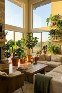
6. Biophilic Accents: Bringing the Outdoors In
 7")
“Biophilic design” sounds like a vocabulary word from my 7th-grade science class. I remember the first time I heard a designer use it, I sort of rolled my eyes. But honestly, it is just a fancy way of saying “bring the outdoors inside.” In a neutral bathroom where we are using colors like sand, stone, and wood, adding actual living nature is the final piece of the puzzle. Without it, the room can feel a bit static or lifeless. You need that pop of green to wake everything up.
The Eucalyptus Shower Hack
This is probably the easiest and cheapest trick in the book, and I tell everyone to do it. Go to the grocery store or a flower shop and grab a bundle of fresh eucalyptus. It usually costs about five bucks. Take a piece of twine and tie the bundle to your shower head (just behind the nozzle so it doesn’t get soaked directly).
When you turn on the hot water, the steam hits the leaves and releases the essential oils. Suddenly, your boring Tuesday morning shower smells like a fancy spa. It helps clear your sinuses too. It usually lasts about two or three weeks before it dries out, and then you just replace it. It looks beautiful and serves a purpose.
Be Real About Your Light
I have killed more plants than I care to admit. I once bought a beautiful, expensive olive tree for my guest bathroom because I saw it in a magazine. Well, that room has one tiny window that faces north. The poor tree was dead in a month.
Please, learn from my wasted money. If your bathroom doesn’t have great natural light, do not buy sun-loving plants. You are just setting yourself up for failure. Instead, look for the “tough guys” of the plant world. Snake plants (Mother-in-Law’s Tongue) and ZZ plants are practically indestructible. They can live in low light and don’t mind the humidity from the shower. Pothos vines are great too—I have one trailing off a high shelf, and it makes the room feel like a jungle.
Dead Plants Are Okay (Sort Of)
If you have a windowless bathroom, or if you just have a “black thumb,” dried botanicals are your best friend. I used to think dried flowers looked dusty, but they are very trendy right now.
I have a large earthenware vase in the corner filled with dried pampas grass. It adds that fluffy, soft texture we talked about earlier. Cotton stems or dried lavender work well too. Since they are already dried, they don’t need light or water. They just sit there looking pretty and adding that organic, earthy vibe without any effort from you.
Stone and Wood Accessories
Remember, “nature” doesn’t just mean green leaves. It means natural materials. I swapped out my old plastic soap dispenser for one made of rough river stone. It feels heavy and cool to the touch, like a rock you would find in a creek. Using a wooden bath brush instead of a plastic loofah counts too. These little touches remind our brains of the outdoors, which naturally helps us relax.
7. The “New” Neutrals: Warm Stone & Mushroom
 8")
When I say the word “mushroom” to you, you probably think of pizza toppings or a damp forest floor. You probably don’t think “dream bathroom.” I was the same way. For the longest time, I thought “neutral” just meant fifty shades of white or maybe a very light grey. I was terrified of going darker. I thought if I painted a small bathroom a dark color, it would feel like a cave. But in 2026, the definition of neutral has totally shifted, and I am officially obsessed with these deeper, moodier tones.
Why “Mushroom” is the New Grey
We are calling these colors “mushroom,” “putty,” or “taupe.” Basically, they are those earthy, brownish-greys that sit right in the middle of the color wheel. They aren’t cold like slate blue, but they aren’t yellow like old-school beige. They are warm and grounding.
I recently painted a powder room in a deep mushroom color—walls, trim, everything. I was sweating while the paint was wet because it looked dark. But once it dried? Wow. It didn’t feel small; it felt cozy. It felt like a warm blanket. These colors absorb the light instead of bouncing it around like crazy, which actually makes the walls recede. It gives the room a sense of depth that white paint just can’t give you.
Travertine is Back (Yes, Really)
If you grew up in the 90s or 2000s, you probably remember travertine tile. It was everywhere, usually in a weird orange-y beige. Well, it is back, but the new version is different. We are seeing “silver” or “creamy” travertine that is cut to show off its natural holes and veins.
I love this stone because it is perfectly imperfect. It has texture built right in. It’s porous and rough, which is that “wabi-sabi” vibe—finding beauty in things that aren’t perfect. In a modern bathroom, a travertine floor or vanity top adds so much character. It tells you that this is real stone, not a printed ceramic tile from a factory.
The “Cocoon” Effect: Paint the Ceiling!
Here is a trick that scares people but always looks high-end: paint your ceiling the same color as your walls. We are so used to “Ceiling White” right out of the can. But if you have gone with a warm mushroom or taupe on the walls, a stark white ceiling breaks the illusion. It creates a harsh line that draws your eye up and stops the flow.
By painting the ceiling the same shade (or maybe one shade lighter), you create a “cocoon” effect. The edges of the room disappear. It feels enveloping and safe. It turns the bathroom into a true sanctuary where you can hide away from the world.
Matte Over Gloss, Always
To pull off these darker neutrals, you have to watch your finishes. High-gloss paint or polished stone can look a bit cheap or “plastic” in these colors. Stick to matte or eggshell finishes for paint, and honed (matte) finishes for stone. Matte surfaces soak up the light and feel soft to the touch. It creates that velvety look that screams luxury without trying too hard.
Conclusion
We have covered a lot of ground today, haven’t we? If you had told me ten years ago that I would be writing a love letter to beige bathrooms, I would have laughed. But as I have gotten older (and maybe a little more tired from teaching middle schoolers all day), I have realized something important. Your home doesn’t need to be a loud, colorful showplace to impress your neighbors. It needs to be a place that takes care of you.
It’s About How It Makes You Feel
That is really the main takeaway here. Creating a neutral bathroom isn’t just about following a trend for 2026. It is about creating a feeling. When I walk into my bathroom now, with the warm walnut wood, the soft limewash walls, and that silly little eucalyptus bundle in the shower, my shoulders literally drop about two inches. The stress of grading papers and dealing with life just sort of melts away.
A neutral palette creates a “quiet” visual space. It doesn’t demand your attention. It lets your brain rest. And honestly, in this crazy busy world, isn’t that what we all need a little more of?
Don’t Rush the Process
If you are sitting there looking at your current bathroom and feeling discouraged, please stop. You do not have to gut the whole room this weekend. Real design takes time. Start small. Maybe you just swap out those cold chrome faucet handles for some warm brass ones. Maybe you paint the walls a moody mushroom color and see how it feels for a week.
I have made the mistake of rushing to finish a room because I wanted it “done,” and I always regretted it. Live with the space. Buy one nice stone soap dish. Add a plant. See how the light hits the room at 4 PM. Build the layers slowly. It is much better to have a room that feels collected and personal than one that looks like you bought the entire display floor at a furniture store in one day.
Make It Yours
Finally, remember that these are just ideas. They are guideposts, not laws. If you hate gold hardware, don’t use it! If you think textured walls look messy, stick to smooth paint. The best “quiet luxury” is a space that works for you and makes you happy.
I hope these tips help you look at “beige” in a whole new way. It’s not boring; it’s the foundation for a calm, beautiful life. Now, go pour yourself a cup of tea, stare at some paint chips, and dream up your perfect sanctuary. You deserve it.
Found this helpful? Pin these ideas to your “Dream Bathroom 2026” board on Pinterest so you can find them later when you are ready to start your project!